Want to understand everything about exploratory data analysis in Python? Let’s start with the what first.
In data science and especially predictive analytics, a model-building cycle goes through three stages: Pre-modeling, Modeling, and Post-modeling. While the Modeling stage deals with algorithm selection, model building, etc., and Post-modeling with model evaluation, validation, and deployment, the Pre-Modeling stage can make or break the model. It’s because predictive models work as well as the data they are built upon.
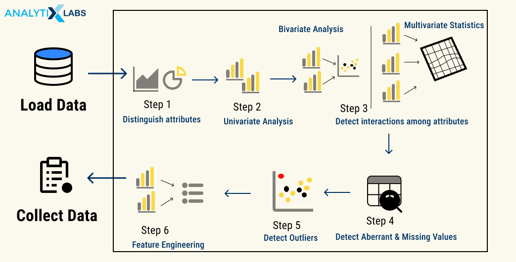
Several steps are taken in the Pre-Modeling stage to ensure that the data being fed to the model is of good quality. These include Exploratory Data Analysis (EDA), Data Preprocessing, and Feature Engineering (FE).
In this article, you will learn about EDA and its process, tools, and techniques, the difference between Data Preprocessing and Feature Engineering, and how to do Exploratory Data Analysis in Python.
Also Read: Data Analysis vs. Interpretation: What is the Difference?
What is Exploratory Data Analysis (EDA)?
EDA is the first step when developing a data model or analyzing data. EDA encompasses all the various subtasks that allow you to understand the data you are dealing with. These tasks include describing, summarizing, visualizing, and understanding the relationship between data features.
Therefore, as the term suggests, EDA refers to all the steps undertaken by a data science professional to “explore” and consequently understand the traits of data and its variables.
EDA typically aims to answer specific preliminary questions before any significant changes or manipulation can be done to the data and be fed to a predictive model.
These questions include-
- What kind of data am I dealing with?
Here the user tries to identify the fundamental characteristics of the data, such as its file format, volume, number of rows and columns, metadata, structure, type and data types of columns, etc.)
- What is the complexity level of the data?
Data may comprise many files and be connected through primary and secondary keys. The user, therefore, needs to understand such relations and find if the data is nested or if some fields have nested data.
- Does the data serve my purpose?
Data is extracted to serve a purpose. For example, if you want to develop a predictive model that forecasts Sales, then the data should have the sales number for the model to analyze patterns and extrapolate them. Therefore the data must be able to answer the business questions for which the data is being used.
- Is my data clean?
Users need to check if the data is unclean or not. Unclean data refers to data that has missing values, outliers, incorrect data types, unconventional column names, etc. The identification of such drawbacks in the data allows users to mark them and solve these issues at a later stage.
- What is the relationship between the features of the data?
Predictive models often have multicollinearity issues while seeking a strong relationship between the independent features and the dependent variables. Therefore, before starting, a user needs to understand the features’ relationship among themselves and how strong this relationship is.
While these are some of the critical questions that EDA tries to answer, it is not an exhaustive list. Let us look at the motivation behind performing EDA.
Motivation for Exploratory Data Analysis
EDA doesn’t describe the data just for a better understanding of it. Instead of just describing, summarizing, and visualizing the data, it achieves multiple goals crucial in the later steps of Data Preprocessing, Feature Engineering, Model Development, Model Validation, Model Evaluation, and Model Deployment.
The main reasons why EDA is performed, apart from the few discussed above, are the following-
- Identifying outliers and missing values
- Identifying trends in time and space
- Uncover patterns related to the target (dependent variable)
- Creating hypotheses and testing them through experiments
- Identifying new sources of data
- Enable data-driven decision
- Test underlying assumptions (especially for implementing statistical models)
- Identify essential and unnecessary features
- Examine distributions such as examination of Normality
- Assess data quality
- Graphical representation of data for quick analysis
Types of Exploratory Data Analysis in Python
The most crucial aspect of EDA is understanding the datasets and their variables. While certain EDA steps aim to provide some general information about the dataset, such as the number of rows and columns, column names, column data types, number of duplicate rows, etc., EDA’s crux understands the variables in-depth .
An EDA professional tries to describe the data and understand its features and characteristics and their relationship with other variables. Understanding the variables is crucial in identifying the right preprocessing and feature engineering required for the data.
The variable can be understood using statistics (non-graphical) and graphs (graphical) and by analyzing one (univariate), two (bivariate), or more (multivariate) variables together.
Therefore, the following types of EDA for understanding data are as follows-
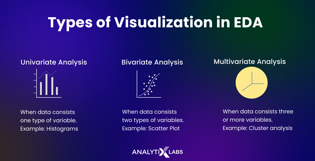
Univariate non-graphical
Univariate analysis is the most basic analysis, where only one variable is understood at a time. In non-graphical univariate analysis, descriptive statistics are used along with some hypothesis tests, and basic exploratory functions are used to understand the data. The typical calculations done here include the following-
- data type
- number of duplicates
- type of variable
- mean
- median
- mode
- minimum and maximum
- interquartile range
- variance
- coefficient of variance
- standard deviation
- skewness
- kurtosis
- one sample t-test
- dependent t-test
- one-way ANOVA (F-test)
- number of missing values
- identification of outliers
Univariate graphical
Next, you can understand the variables by visualizing them. Various types of graphs can be created for this purpose, such as-
- Histogram
- Frequency Bar Chart
- Frequency Pie Chart
- Box Plot
- Univariate Line Chart
Also Read: How Univariate Analysis helps in Understanding Data
Bivariate non-graphical
Under non-graphical bivariate analysis, you analyze two variables using descriptive and mainly inferential statistics to understand their relationship. The typical steps performed here include the following-
- Aggregation and summarization using categorical and a numerical variable
- Cross frequency tables
- Correlation Coefficient
- Dependent t-Test
- Chi-Square Test
Bivariate graphical
In bivariate graphical analysis, those charts are created that use two variables to understand their connection. Typical graphs created at this stage include the following-
- Bar Chart
- Pie Chart
- Line Chart
- Scatter Plot
- Box Plot
Multivariate non-graphical
Often more than one variable needs to be analyzed together better to understand the level of complexity in the data. Common steps taken at this stage include
- Correlation Matrix
- Frequency or Statistical Cross Tables
- Simple Linear Regression
Multivariate graphical
Various graphs can also be created using more than two variables to help us understand how the variables are related. Standard multivariate charts include-
- Scatter Plot
- Heat Map
- Stacked / Dodged Bar Chart
- Multiline Chart
To better understand all the various types of EDA discussed so far, you need to perform EDA, and the next section explores just that.
Performing Exploratory Data Analysis in Python
By taking an example dataset, let’s now address how to do EDA in Python [step-by-step guide].
Step 1: Define objective, acquire, and collate data
Many EDA projects in Python are out there that look at various kinds of datasets and explore them. However, this article considers data from a car insurance company. For example, there is a need to perform market analysis.
For that, the data science team needs to understand better their customer base and eventually create a predictive model that predicts the claim amount for a customer.
A customer 360 dataset is required to comprehend the customers fully where all information about the customer is there, from information about them to the information regarding the insurance products they bought.
Import data
A data science professional needs to get hold of the data that can solve complex business problems. The required data can often be fragmented and needs to be collected and combined into a single dataset for analysis. The data sources vary from surveys and social media analytics to customer reviews and log files.
For example, the required data is in three separate sources, which you identify, access, and then import into your jupyter notebook to start the analysis.
The details of the three datasets are as follows-
- Dataset #1: Having customer’s demographic information
- Dataset #2: Having information about the insurance policy the customer has bought
- Dataset #3: Having information about the insurance claims
# importing pandas
import pandas as pd
# importing numpy
import numpy as np
# importing scipy
from scipy import stats
# import seaborn
import seaborn as sns
# import pyplot
import matplotlib.pyplot as plt
# importing the demographic data
demographic_details = pd.read_csv(‘Insurance_Company_Customer_Demographics.csv’)
# importing the insurance policy details
policy_details = pd.read_excel(‘Insurance_Company_Customer_Insurance_Details.xlsx’,sheet_name=‘Policy_Details’)
# importing the insurance claim details
claim_details = pd.read_excel(‘Insurance_Company_Customer_Insurance_Details.xlsx’,sheet_name=‘Claim_Details’)
Once the required modules and the dataset are imported, you can view the dataset to understand its contents and how to combine them.
View data
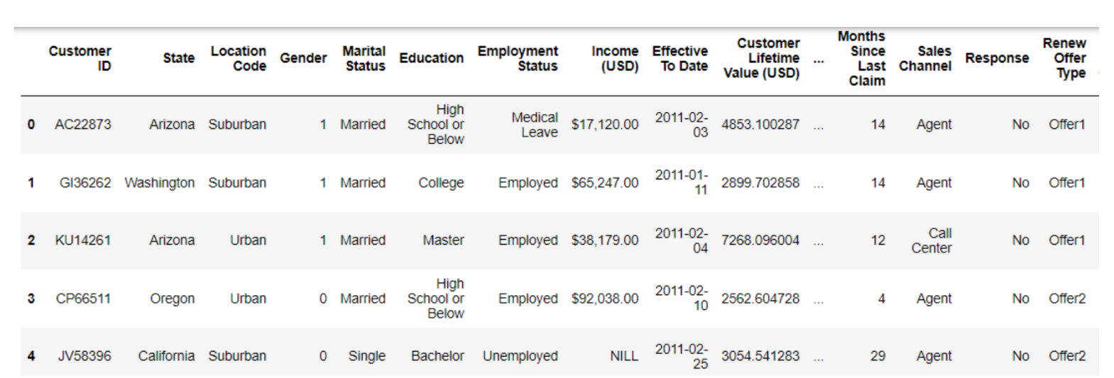
#viewing demographic data
demographic_details.head(5)
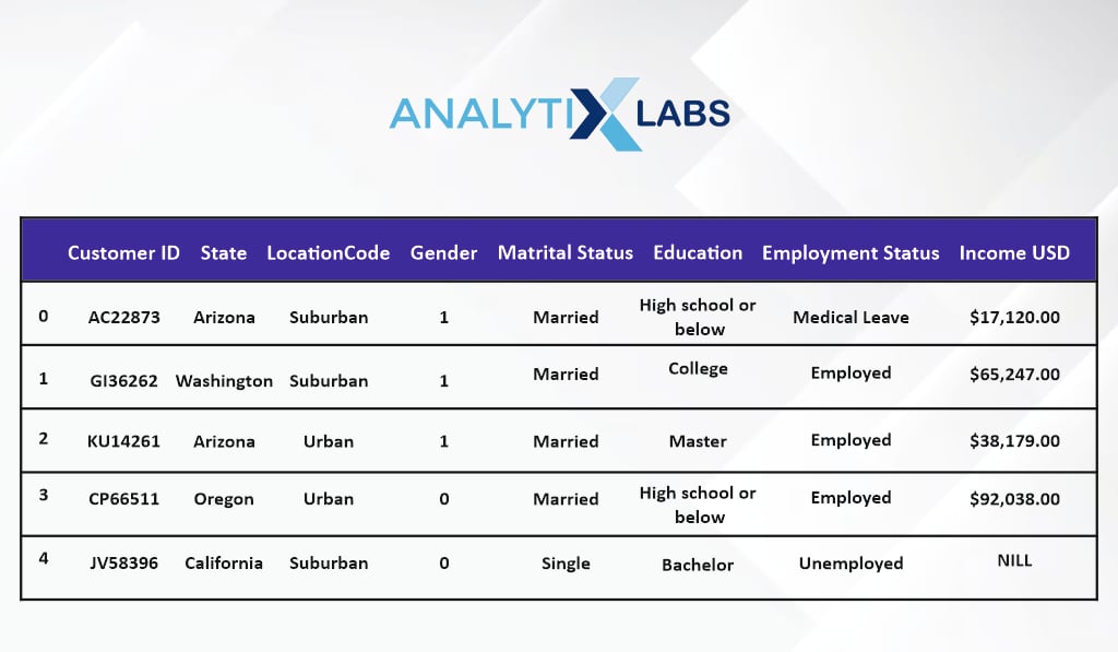
The first data has details regarding the customer, such as their gender, education, income, etc.
#viewing demographic data
policy_details.head(5)
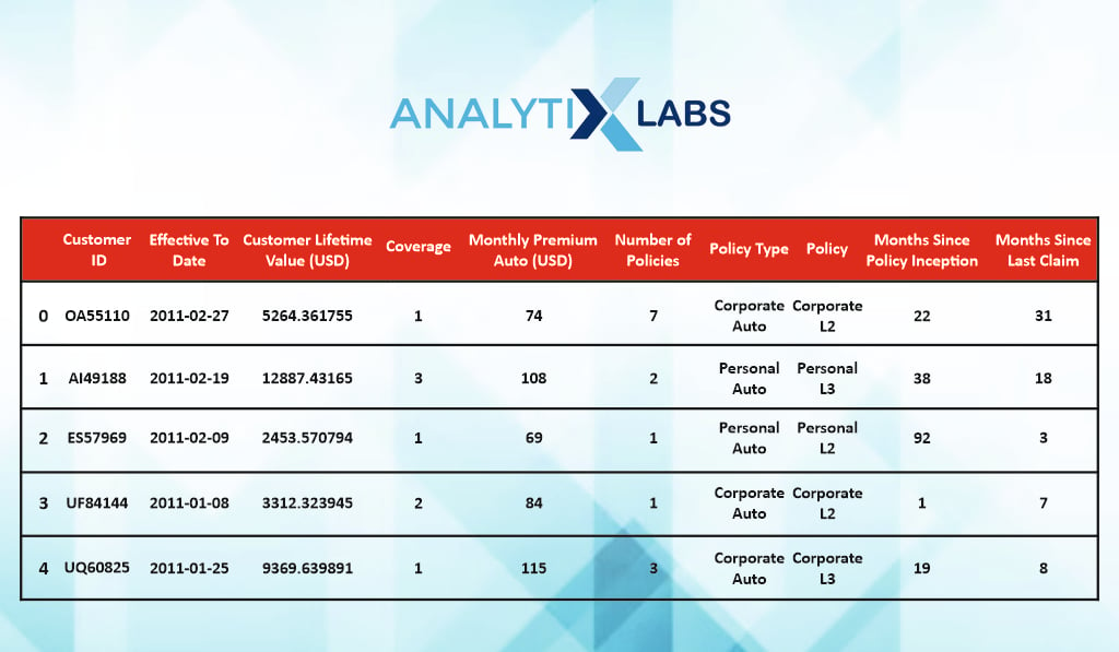
The second dataset has information regarding the nature of the policy they have purchased.
#viewing claim details
claim_details.head(5)
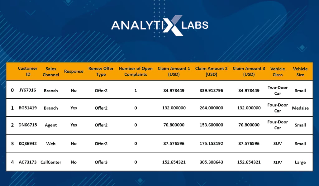
The third data is information regarding the insurance claim, raised complaints, etc.
Collate data
#combining data #1 with #2mrg_df = pd.merge(left=
demographic_details, right =
policy_details, on=‘Customer ID’,
how= ‘inner’)
#combining data #1 and #2 with data #3
df = pd.merge (left = mrg_df,
right=claim_details, on=’Customer ID’,
how=’inner’)
#viewing the first 5 rows
df.head()
‘Customer ID’ is the common variable in all three datasets and is the primary key to combining all three datasets into one. From this point forward, the EDA in Python will be performed on this dataset.
Step 2: Basic information
Column names
#viewing the column names
df.columns
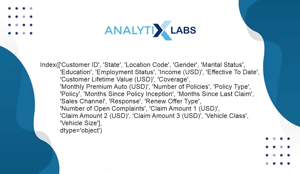
You first start by looking at all the column names to understand the kind of information in the data. Let’s say you notice the names in the data are not as per Python conventions and have space and other special characters.
The scope of EDA is to explore the data and identify such issues so that they can be addressed when performing data preprocessing and feature engineering. However, you can switch back and forth from EDA to other steps and perform preprocessing and feature engineering while performing EDA. Therefore, you can make the column per Python conventions in this case.
#making the column names as per Python conventions
df.columns = df.columns.str.replace(” “,” “)
df.columns = df.columns.str.replace(“(” “,” “)
df.columns = df.columns.str.replace(“)”,” “)
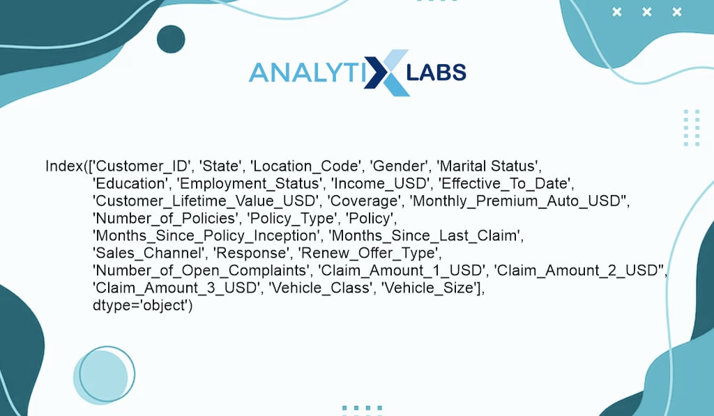
Removing the unnecessary characters from the column names makes it easier to operate on such columns when performing EDA in Python.
Check duplicate rows
#checking duplicate rows
df.duplicated()[df.duplicated()==True]
You start by checking for any duplicate rows, as when performing data exploration in Python, duplicate rows can cause issues. In your case, you don’t have any duplicate rows.
No. of rows and columns
#finding number of rows and columns
print(“number of rows: “, df.shape[0])
print(“number of columns: “, df.shape[1])
# finding number of rows and columns print("number of rows: ", df.shape[0]) print("number of columns: ", df.shape[1])
No. of Rows:9134 No of Columns: 26
The next important thing in Python data exploration is to know the dimensions of the data, as it allows you to use functionalities like .iloc if required. In your case, you have 9,134 rows and 26 columns.
Data type of columns
#viewing the data types of columns
df.dtypes
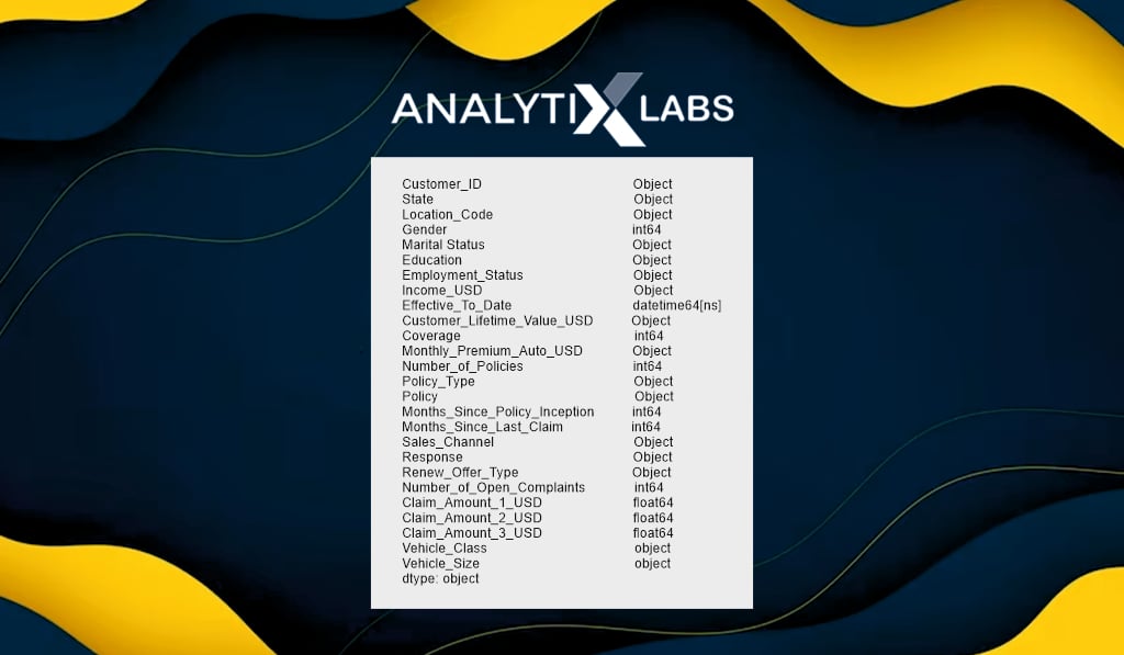
When performing exploratory data analysis in Python, you use various functions, often dependent on the column’s data type. Therefore identifying the data type of columns is important.
Combining the identified similar variable
#Combining the identified similar variables
df[‘Total_Claim_Amount’] = df.Claim_Amount_1_USD +
df.Claim_Amount_2_USD + df.Claim_Amount_3_USD
You can perform another feature engineering step in the middle of EDA by looking at the columns above; a ‘Total_Claim Amount’ column can be created by summing all the claim amount columns.
Such a column will later be the dependent variable if you make a predictive model using this data. Here you add such a step of feature engineering to help you perform EDA.
Different Types of Exploratory Data Analysis in Python
Univariate non-graphical EDA
Let’s start with univariate non-graphical analysis, exploring one column at a time using statistics and other basic Python EDA functions.
Column Data Type
#checking data type
df.Income_USD.dtype
Interestingly, the column ‘Income_USD’ data type is being shown as ‘O’, i.e., Object, which refers to a string data type which should not be the case. As per the column name, the data type should be numeric, like float.
#identifying why certain columns don’t have the correct data type e.g. ‘Income_USD’
df.Income_USD.value_counts()
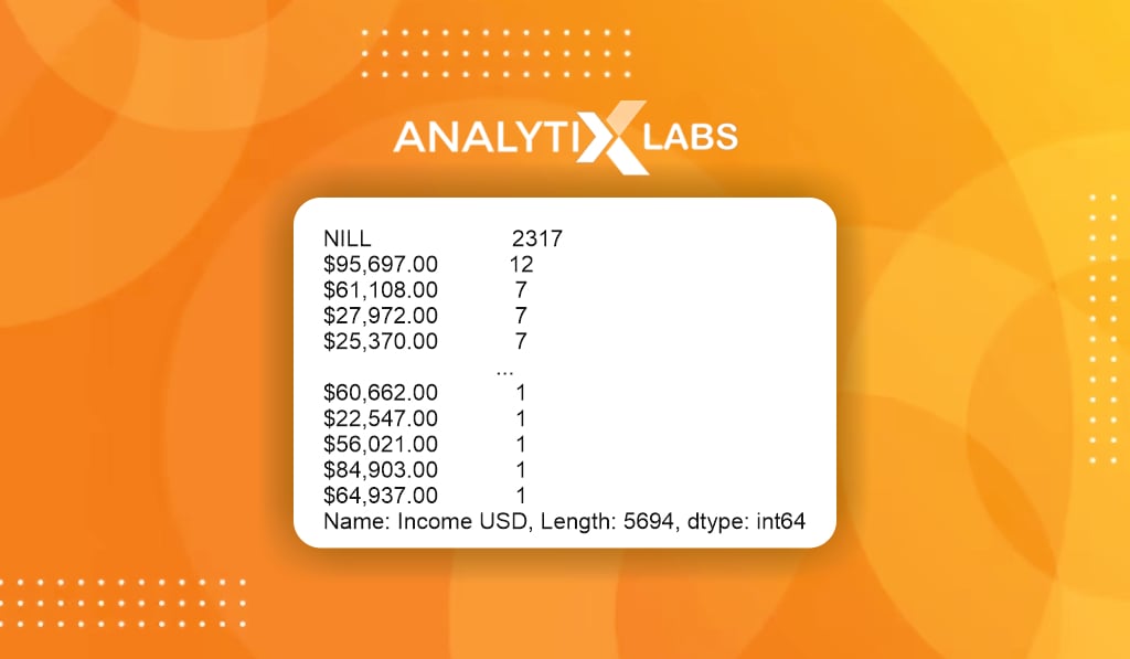
By exploring the variable or by looking at the data dictionary, you find that ‘NILL’ is being mentioned in place of 0 and ‘$’ and ‘, ‘ is in the data causing it to have a string-based data type.
#resolving the above identified issues
df.Income_USD =df.Income_USD.str.replace(‘NILL’, ‘0’)
df.Income_USD =df.Income_USD.str.replace(‘$’, ‘ ‘)
df.Income_USD =df.Income_USD.str.replace(‘ , ‘, ‘ ‘)
df.Income_USD =df.Income_USD.astype(‘float’)
You can replace the characters with appropriate values and perform feature engineering by converting the column’s data type.
#identifying why certain columns don’t have the correct data type e.g.
#’Customer_Lifetime_Value_USD’
df.Customer_Lifetime_Value_USD.value_counts()
Similarly, you can look at ‘Customer_Lifetime_Value_USD’ also. There too, seems to be a mismatch of data type.
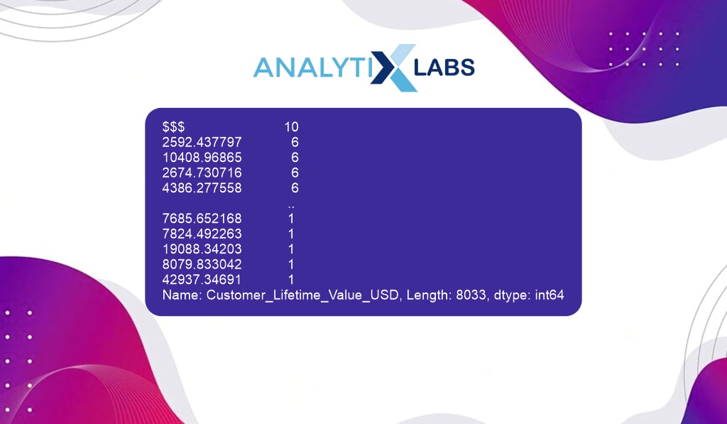
Here it seems that in place of missings, some specials characters ‘$$$’ have been mentioned.
#resolving the above identified issues
df[‘Customer_Lifetime_Value_USD’].loc[df [‘Customer
_lifetime_value_USD]==’$$$’,] = np.nandf.Customer_Lifetime_Value_USD = df.Customer_Lifetime_Value_USD.astype(‘float’)
If required, you can perform feature engineering here, replace the special character with the missing value, and convert the column’s data type to an appropriate one.
Type of variable
The next important step in Python data exploration is to understand the type of variable you are dealing with. The type of variables are different from the data type of columns as here you try to understand the nature of data stored in it.
Common types of variables include numerical (continuous or discrete) and categorical (binary, nominal, or ordinal).
#identifying the type of variable
df.Gender.unique()
By looking at the categories of the column ‘Gender’, it is a nominal categorical variable that has been label encoded.
#identifying the type of variable
df.Vehicle_size.unique()
array(['Midsize', 'Small', 'Large'], dtype=object)
The column ‘Vehicle_Size’ categories suggest that it is an ordinal categorical variable.
Counting missing variables
Knowing the column’s missing values and its quantum is crucial when working on EDA projects in Python. If a column has an extremely high amount of missing values, then such a column may be dropped.
#calculating the missing values
df.State.isnull(). sum() [df.State.isnull(). sum()>0] [0]
**20**
In your dataset, for example, the column ‘State’ seems to have 20 missing values. You can identify the missing values for all the columns and treat them using the appropriate imputation method based on the variable type or drop them.
Outlier identification
Statistics and statistical functions play an important role in Python data exploration, and they are highly susceptible to outliers. Therefore one needs to identify the outliers (and cap them as part of feature engineering) so that the subsequent results of EDA that use statistics are correct.
#Calculating upper cap using IQR
Q1, Q3 = df.Income_USD.quantile ([0.25,0.75])
IQR = Q3-Q1
UC = Q3 + (IQR*1.5)
#identifying upper outliers
df.Income_USD[df.Income_USD>UC]
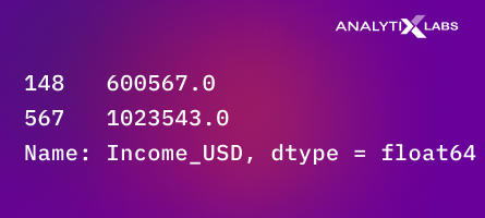
For example, you identify the upper outliers for the ‘Income_USD’ column using the IQR method and find two such outliers.
#Outlier capping
df.Income_USD[df.Income_USD>UC] = UC
You can perform feature engineering here and cap them on the spot.
Duplicate values
#checking duplicate customer id
df.Customer_ID.duplicated()
[df.Customer_ID.duplicated()==1]
**series ([], Name: Customer_ID, dtype: bool)**
In datasets that are at a customer level, you need to ensure that each row provides information about a unique customer. Therefore, here you check for duplicates in the customer id; luckily, there are no duplicates in the column.
Descriptive summary Statistics
# calculating mean
print(“mean: “, df.Total_Claim_Amount.mean() )
# calculating median
print(“median: “, df.Total_Claim_Amount.median() )
# calculating mode
print(“mode: “, df.Total_Claim_Amount.mode() )
# calculating variance
print(“variance: “, df.Total_Claim_Amount.var() )
# calculating standard deviation
print(“standard deviation: “, df.Total_Claim_Amount.std() )
# calculating minimum
print(“minimum: “, df.Total_Claim_Amount.min() )
# calculating maximum
print(“maximum: “, df.Total_Claim_Amount.max() )
# calculating IQR
print(“IQR: “, stats.iqr(df.Total_Claim_Amount, interpolation = ‘midpoint’) )
# coefficient of variance
print(“coefficient of variance: “, df.Total_Claim_Amount.std()/df.Total_Claim_Amount.mean() )
# calculating skewness
print(“skewness: “, df.Total_Claim_Amount.skew() )
# calculating kurtosis
print(“kurtosis: “, df.Total_Claim_Amount.kurtosis() )
# calculating the cardinality (number of unique values)
print(“unique values: “, df.Total_Claim_Amount.nunique() )
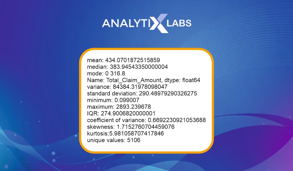
Descriptive statistics play a crucial role in data exploration in Python. As seen above, various Python functions can describe a variable through its mean, median, mode, min, max, standard deviation, etc.
One sample T-test
#running one sample T-test
stats.ttest_1samp(a = df.Total_Claim_Amount,
popmean= 500
In univariate analysis, some hypothesis testing can be done. Here you run a one-sample t-test to check if the average ‘Total_Claim_Amount’ is statistically different from $500.
Independent T-test
#running independent t-test
stats.ttest_ind(a= df.Income_USD[df.Gender==0],
b= df.Income_USD[df.Gender==1],
equal_var=False)
#assuming samples have equal variance
An Independent t-test allows you to understand whether the mean of two categories of a variable is similar. Here, for example, there is little proof that the income of male and female customers is statistically the same.
One-way ANOVA (F-test)
#finding categories
df.Education.value_counts()
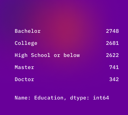
One Way Analysis of Variance, a kind of F-test, allows you to understand if the mean of two or more categories of a variable is similar. Here, for example, there is strong proof that the Income of individuals from different educational backgrounds is statistically similar.
# data for each category
s1 = df.Income_USD[df.Education==’Bachelor’] s2 = df.Income_USD[df.Education==’College’] s3 = df.Income_USD[df.Education==’High School or Below’] s4 = df.Income_USD[df.Education==’Master’] s5 = df.Income_USD[df.Education==’Doctor’]#running one way ANOVA
stats.f_onewat(s2, s2, s3, s4, s5)
**F_onewayResult(statistic=15.32657653737315, pvalue=1.6967129487932849e-12)**
Univariate Graphical EDA
The exploratory data analysis in Python is continued using one variable (univariate); however, now you use graphs to describe the variables.
-
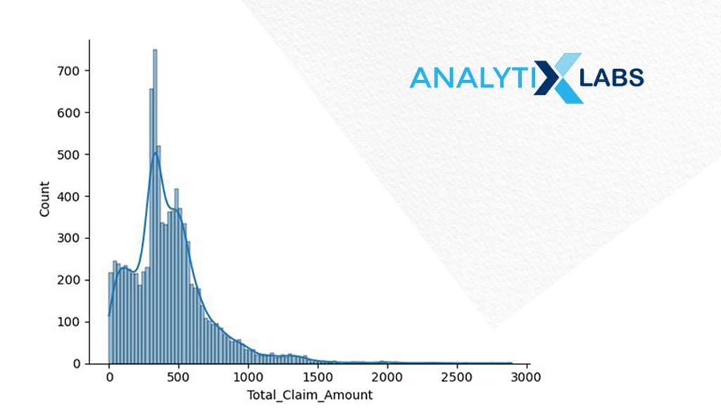
Histogram
# creating histogram
sns.histplot(x = ‘Total_Claim_Amount’, data = df, kde = True)
plt.show()
If you create the histogram of ‘Total_Claim_Amount’, you can understand its distribution. Suppose you intend to use this variable as a dependent variable with a statistical algorithm like linear regression.
In that case, you may want to transform it to ensure its distribution is normal (Gaussian), which presently is not the case.
-
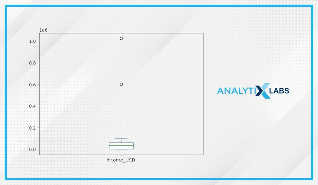
Boxplot
# creating boxplot
df.Income_USD.plot(kind=’box’) plt.show()
The outliers can also be visualized using a boxplot. As seen before using the IQR outlier detection method, there are two outliers in ‘Income_USD.’
-
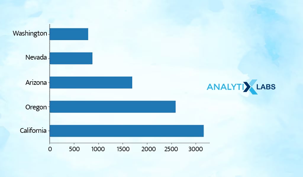
Frequency Bar Chart
# frequency bar chart
df.State.value_counts(normalize = False).plot.barh()
plt.show()
Frequency bar charts allow you to understand the count of each value in a categorical variable. As per the chart, most customers seem to be from California.
-
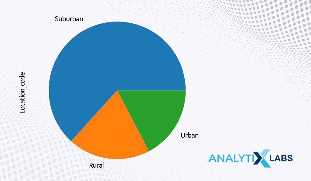
Frequency Pie Chart
# frequency pie chart
df.Location_Code.value_counts(normalize = False).plot.pie()
plt.show()
Just like frequency bar charts, frequency pie charts can also be created. As per the chart, most customers seem to be from a suburban location.
-
Line Chart
# creating line chart
df.Monthly_Premium_Auto_USD.value_counts().sort_index().plot.line()
plt.show()
A univariate line chart uses an index to form one axis. Such graphs are helpful when datetime is used to index data.
Bivariate Non-graphical EDA
The next step in exploratory data analysis in Python is to use two variables to analyze their relationship. Let’s start with bivariate analysis using statistics.
-
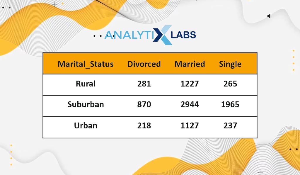
Cross-frequency Tables
# creating cross frequency table
pd.crosstab(df.Location_Code, df.Marital_Status)
A cross-frequency table lets you know the frequency of each unique combination of categories from two categorical variables. For example, most customers are married and are located in suburban areas.
-
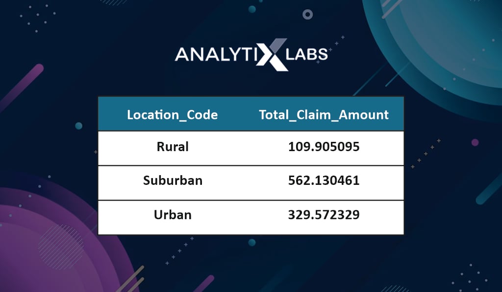
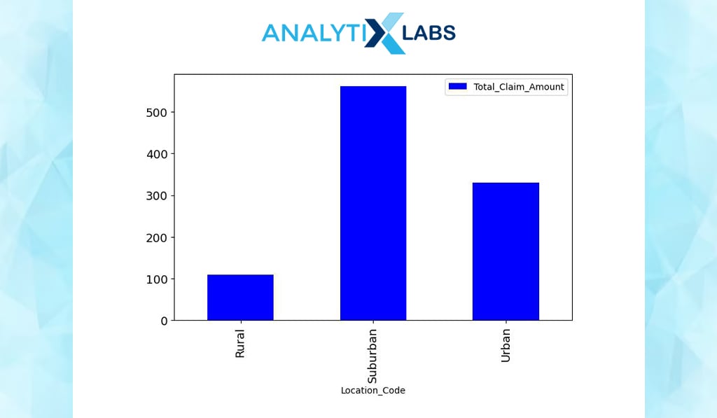
Aggregation and Summarization
# performing aggregation and summarization
df.groupby(by=[‘Location_Code’]).agg({‘Total_Claim_Amount’:‘mean’})
Cross tables can be created using one numerical and one categorical variable. For example, you calculate the sum of ‘Total_Claim_Amount’ for each location type. It seems customers make most claims from suburban areas.
-
Correlation Coefficient
# calculating pearsons correlation coefficient
np.corrcoef(df.Income_USD,df.Total_Claim_Amount)[0][1]
**-0.3549593958604483**
You can use the correlation coefficient to understand the relationship between two numerical columns. Your data shows a negative correlation between income and claim amount, i.e., as the income increases, the claim amount decreases.
-
Chi-Square Test
# converting the numerical data into categorieslabels_vals = [‘Small Claim’,‘Medium Claim’,‘Large Income’, ‘Very Large Claim’]
df[‘Claim_Level’] = pd.qcut(df[‘Total_Claim_Amount’], q=4, duplicates=‘drop’, labels=labels_vals)
# viewing the ‘Claim_Level’ variable
df.Claim_Level.head()
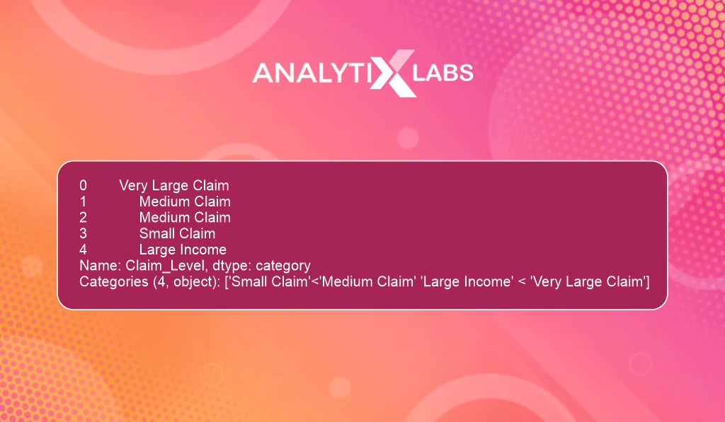
You use the chi-square test to understand the relationship between two categorical columns. Here you convert the claim amount into bins such that they indicate the claim amount level.
# creating the contingency table
contingency_table = pd.crosstab(df.Claim_Level, df.Location_Code, margins = True)
# running chi-square test
stats.chi2_contingency(observed = contingency_table)
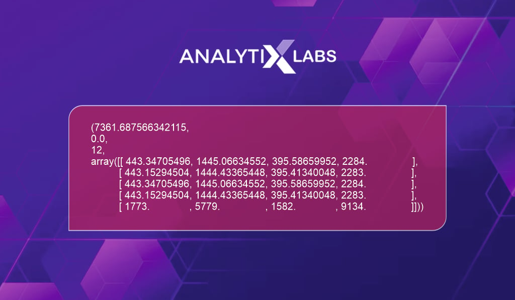
If you run a chi-square to test the relationship between the claim level and location code, then it seems location code strongly influences the claim level.
-
Dependent T-Test
# running dependent t-test
stats.ttest_rel(a = df.Claim_Amount_1_USD, b = df.Claim_Amount_2_USD)
**Ttest_relResult(statistic=142.7974436778173, pvalue=0.0)**
A dependent (paired) t-test allows you to understand whether the mean of two numerical variables is statistically the same. For example, there is strong proof that the Claim_Amount_1 and Claim_Amount_2 columns statistically have the same mean.
Bivariate Graphical EDA
Next, you try to understand the relationship between two columns by creating various graphs.
-
Bar Chart
# creating bar chart
my_graph =
df.groupby(by=[‘Location_Code’]).agg({‘Total_Claim_Amount’:’mean’}).plot(kind=’bar’, figsize=(8,5), color=”blue”, fontsize=13)
You can create a bar chart to understand the numerical and categorical relationship. Below – on the x-axis, you have location type; on the y-axis, the total claim amount.
-
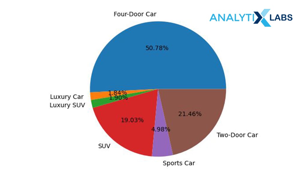
Pie Chart
# creating data
agg_data = df.groupby(by=[‘Vehicle_Class’])[[‘Income_USD’]].sum()
# creating pie chart agg_data.plot(kind=’pie’,subplots=True,autopct=’%.2f%%’,legend=False,figsize=(10,5)) plt.ylabel(“”)
plt.show()
Similar to a bar chart, a pie chart can also be created. Here the income % of all those customers who own different kinds of cars is identified.
-
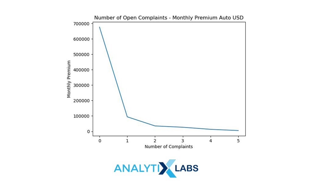
Line Chart
# creating data
agg_data =
df.groupby(by=[‘Number_of_Open_Complaints’])[[‘Monthly_Premium_Auto_USD’]].
sum().reset_index()
# creating line chart
plt.plot(agg_data.Number_of_Open_Complaints, agg_data.Monthly_Premium_Auto_USD)
plt.xlabel(“Number of Complaints”)
plt.ylabel(“Monthly Premium”)
plt.title(“Number of Open Complaints – Monthly Premium Auto USD”)
# add title
plt.show()
You can create a line chart to understand the relationship between two numerical columns. Above, the monthly premium is plotted against the number of complaints which shows that the premium decreases as the complaints increase.
-
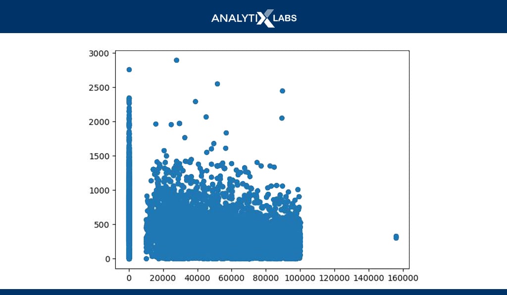
Scatterplot
# creating scatter plot
plt.scatter(x= df.Income_USD, y=df.Total_Claim_Amount) plt.show()
The scatterplot is the most prominently used chart to understand the relationship between two numerical columns. Above, the scatterplot is created using income and claim amount.
-
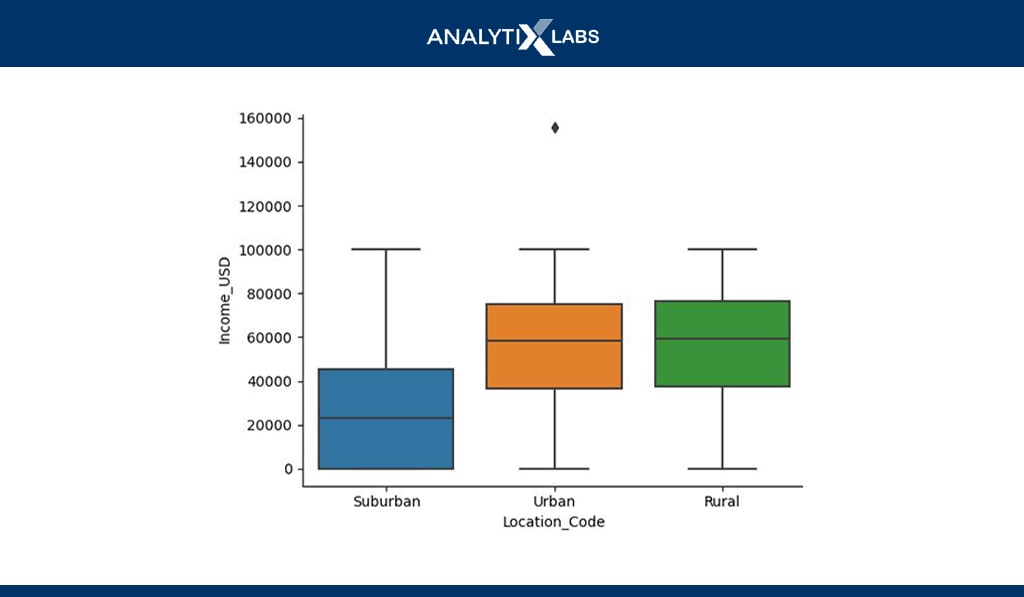
Boxplot
# creating boxplot
sns.boxplot(df.Location_Code, df.Income_USD)
plt.show()
Bivariate boxplots can also be created where a boxplot is created using a numerical variable for each category of a categorical variable. In the example above, boxplots for each category of ‘Location_code’ is created using the income variable.
Multi-variate Non-Graphical EDA
Lastly, one can perform EDA by simultaneously using and analyzing more than two variables. Such an EDA is known as multivariate EDA. Let’s start with non-graphical EDA.
-
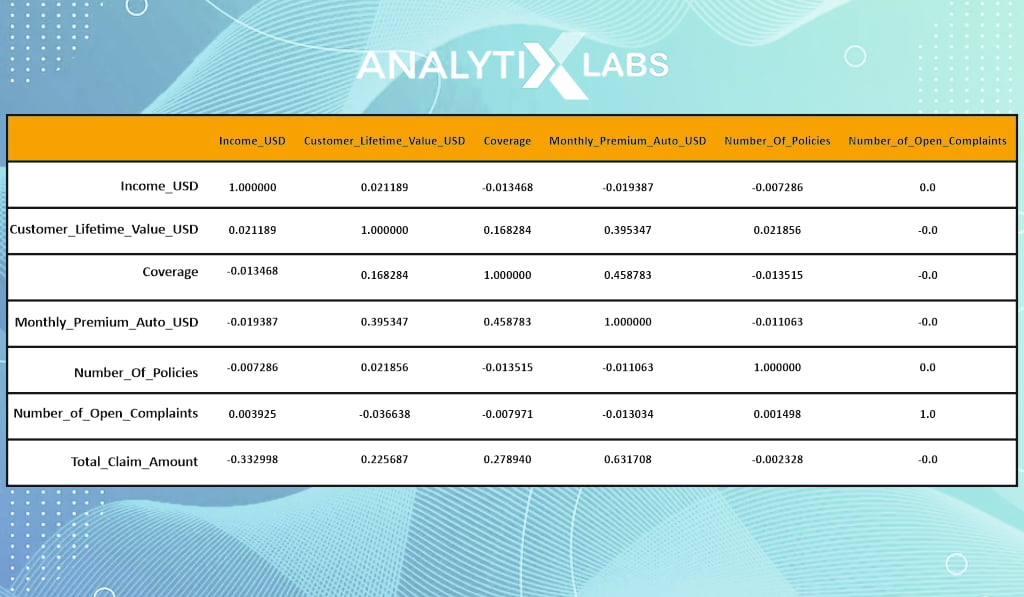
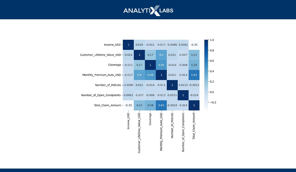
Correlation Matrix
# naming all the columns where the column type is numerical
numerical_columns = [‘Income_USD’,’Customer_Lifetime_Value_USD’,’Coverage’, ‘Monthly_Premium_Auto_USD’,’Number_of_Policies’,’Number_of_Open_Complaints’,
‘Total_Claim_Amount’]# correlation matrix
df[numerical_columns].corr()
You can create a correlation matrix where for every variable, you get the correlation values against all other variables in the dataset. Such matrices are crucial when addressing the issue of multicollinearity and checking various assumptions for statistical algorithms.
-
Multivariate Cross Table
# creating a multivariate cross table
df.groupby(by=[‘Location_Code’,’Marital_Status’]).agg({‘Marital_Status’:’count’,’Total_Claim_Amount’:’mean’,’Income_USD’:’mean’,’Number_of_Open_Complaints’:’count’})
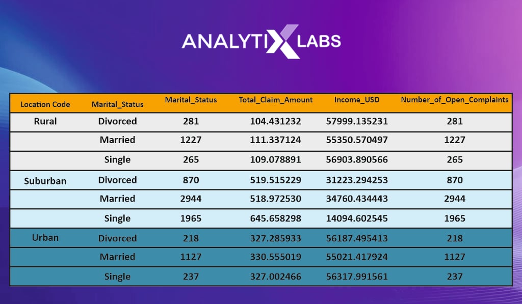
A multivariate cross table can be created using frequency or summary statistics. Above, for example, a cross table is created using two categorical and four numerical columns.
-
Multivariate Regression
# improting the module
import statsmodels.formula.api as sm
# initialization regression model
model = sm.ols(‘Total_Claim_Amount~Income_USD+Gender+Number_of_Open_Complaints’, data=df)
# fitting the model on the dataset
model = model.fit()
# printing model summary
print(model.summary())
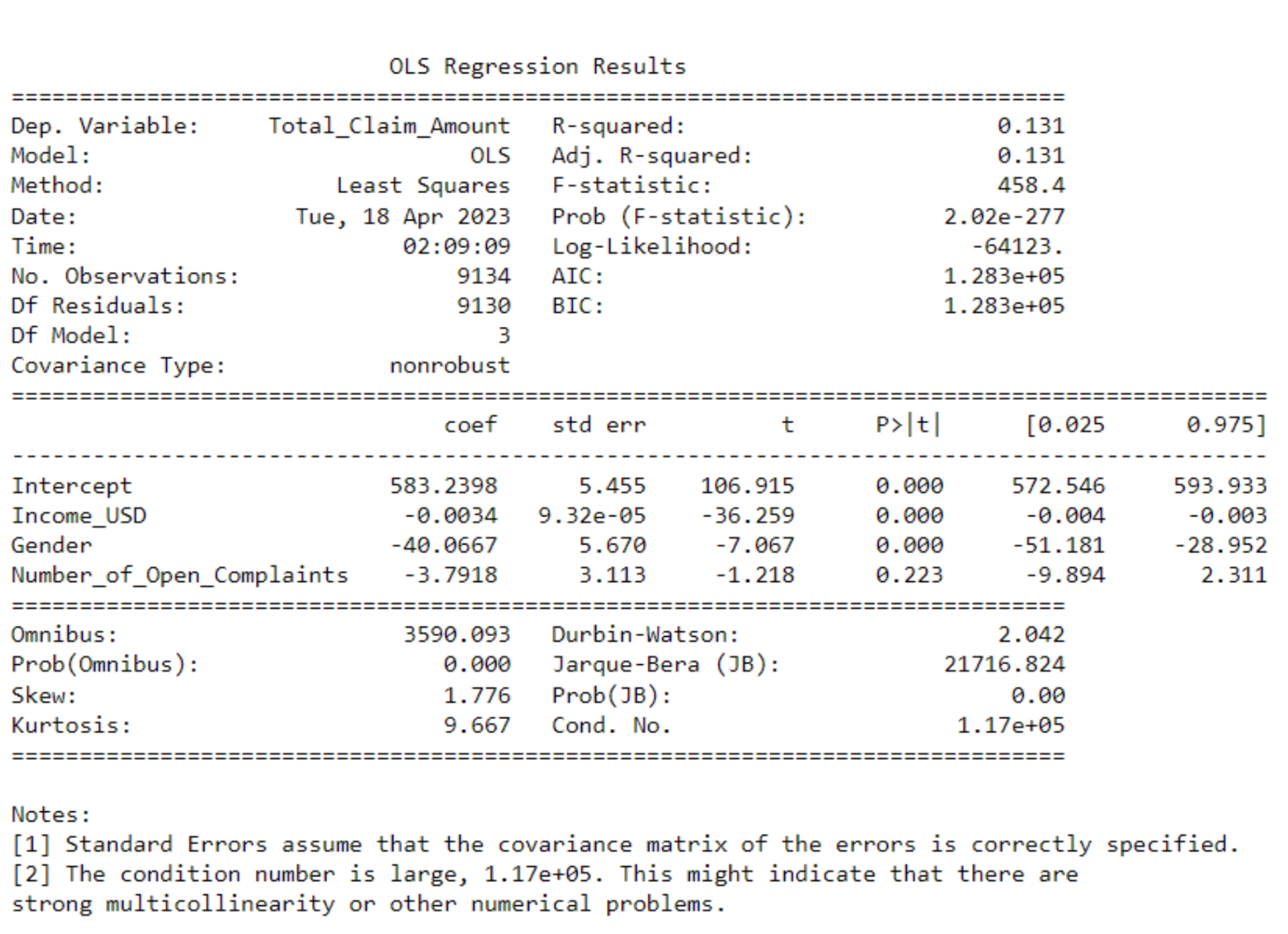
You can run a simple linear regression to understand how certain variables are related to one variable. Above, for example, it seems that the income, gender, and number of complaints don’t seem to have a strong linear relationship with the claim amount.
Multivariate Graphical EDA
Let’s end the discussion on exploratory data analysis in Python by performing multivariate EDA using graphs.
-
Scatterplot
# creating scatterplot sns.lmplot(data=df,x=”Income_USD”,y=”Total_Claim_Amount”,fit_reg=False,hue=”State”,palette=[“green”,”blue”,”red”,”purple”,”black”])
plt.show()
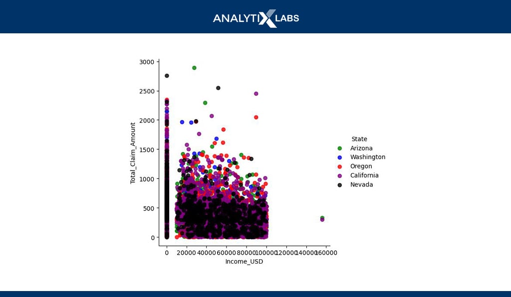
You can easily create a scatterplot using two numerical and a categorical variable. Above, for example, the scatterplot between income and claim amount is created where each data point (dot) also indicates the location it belongs to.
-
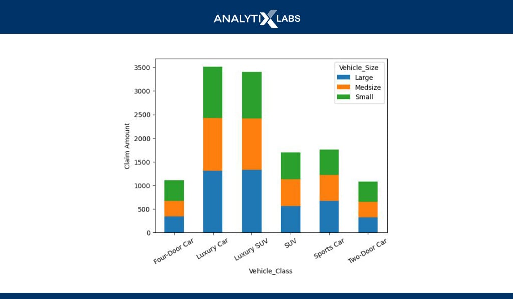
Stacked/Dodged Bar Chart
# creating the dataset
df_agg =
df.groupby(by=[‘Vehicle_Class’,’Vehicle_Size’])[[‘Total_Claim_Amount’]].mean()
df_agg =df_agg.reset_index()
df_agg = df_agg.pivot_table(index=’Vehicle_Class’, columns=’Vehicle_Size’,values=’Total_Claim_Amount’)
# creating stacked bar chart
df_agg.plot(kind=’bar’,stacked=True)
plt.ylabel(“Claim Amount”)
plt.xticks(rotation=’30’)
plt.show()
You can use stacked or dodged bar charts to visualize two categorical and one numerical variable. For example, the vehicle class and size are plotted against the claim amount, which shows that the claim amount is most for luxury cars, with all their sizes having roughly the same contribution.
-
Multiline Chart
# creating data
agg_data =
df.groupby(by=[‘Number_of_Open_Complaints’])[[‘Claim_Amount_1_USD’,’Claim_Amount_2_USD’,’Claim_Amount_3_USD’]].sum().reset_index()
# defining data values
x = agg_data.Number_of_Open_Complaints
y1 = agg_data.Claim_Amount_1_USD
y2 = agg_data.Claim_Amount_2_USD
y3 = agg_data.Claim_Amount_3_USD
# creating line chart
plt.plot(x, y1, ‘g’, label=’Claim Amount #1′)
# adding another line on the same chart
plt.plot(x, y2, ‘r’, label=’Claim Amount #2′)
# adding another line on the same chart
plt.plot(x, y3, ‘b’, label=’Claim Amount #3′)
# showing graph
plt.xlabel(“Number of Complaints”)
plt.ylabel(“Claim Amount”)
plt.title(“Number of Open Complaints – Claim Amount”)
plt.legend()
plt.show()
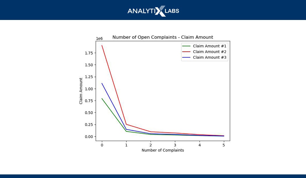
Multiline charts allow you to plot multiple numerical columns against another numerical or ordinal categorical column. Above, for example, the different claim amounts are plotted against the number of complaints.
-
Heatmap
# correlation matrix heat map
sns.heatmap(df[numerical_columns].corr(), annot=True, cmap = ‘Blues’)
Heatmaps can be created to visualize tables such as a correlation matrix. Above, a heat map is created using the correlation matrix created during multivariate non-graphical EDA. Such a graphical matrix representation helps identify the highly correlated variables.
As you have seen, much work goes into performing EDA in Python. There are, however, few libraries that help you to come up with quick EDA reports. While they may not be as flexible as writing all the required code manually (as done above), they still help give you a good starting point.
A few of the important libraries are listed in the next section.
Tools & Libraries for Exploratory Data Analysis
While many tools can be used to perform EDA, the two primary tools are Python and R. Both are open-source programming languages that allow you to perform EDA and all sorts of data science operations, from data mining and cleaning to model development and deployment.
As seen above, In Python, EDA plays a crucial part when understanding the imported data, and one needs to write numerous functions. However, there are now dedicated libraries in Python and R that allow you to develop a detailed EDA report by writing a single line of code.
The most prominent EDA libraries are:
Python Libraries
- Pandas Profiling
- Sweetviz
- Autoviz
- D-Tale
- Skim
- Dataprep
- Klib
- Dabl
- SpeedML
- Datatile
R Libraries
- Data Explorer
- SmartEDA
- DataMaid
- Dlookr
- GGally
- Skimr
Also Read: 50 Ultimate Python Data Science Libraries to Learn
If you would run these libraries or if you would have noticed in the types of EDA section, descriptive statistics play a crucial role, especially in univariate analysis.
Therefore, to perform EDA effectively, you need to understand descriptive statistics and how it helps us understand the data. Let’s explore this topic next.
Understanding Descriptive Statistics
Statistics plays a crucial role in EDA. Statistics can be broadly divided into descriptive and inferential statistics. Descriptive statistics is where you try to summarize a variable/data by describing it.
In inferential statistics, several hypothesis tests are used to determine probabilities and assess the relationship of variables with the population.
A cube can be described by measuring its length, breadth, height, and mass, and a variable can be described by measuring frequency, central tendency, variability, and shape.
Also Read: Descriptive vs. Inferential Statistics
-
Measure of Frequency
This measure calculates the count of each value in a variable. For example, in a categorical variable, the count of each category is calculated, while the same is done for a numerical variable where the frequency of each is calculated.
In the measure of frequency, the result can be presented in the form of cross tabs or through graphs such as histograms (for numerical variables) or bar charts and pie charts (for categorical variables).
-
Measure of Central Tendency
The next crucial statistic that helps in describing data is its central value. A central value of the data can help you summarize it and give you a sense of it.
For example, if a variable has a data scientist’s salary in Mumbai, then a central value can easily define it.
However, how to calculate this central value is something that you need t understand as there is more than one way of calculating this value.
- Mean: Arithmetic means, sometimes referred to as average, is calculated by taking the sum of all values in the data and dividing it by the number of observations in the data. Mean is a very good summary statistic as it considers all the data values in its calculation but is susceptible to outliers that can substantially alter its value.
- Median__: The next critical measure of central tendency is the median, which indicates the middle value when the data is arranged according to the order of magnitude. The median, therefore, divides the data into two equal haves such that 50% of the data is above and below it. As the median doesn’t consider all the values of the data in its calculation (i.e., it doesn’t get affected by the actual values in the data but rather by their position), it makes it less susceptible to outliers.
- Mode: The last measure is the mode. It is similar to a measure of frequency because the count of each unique value in the data, i.e., their frequency, is calculated here. Mode refers to the value that has the highest frequency. Mode is useful to identify the central tendency for a categorical variable where its difficult to calculate the mean or median. The issue, however, with the mode is that data can have more than one mode. Such data is bimodal (where there are two modes) or multimodal (with more than two modes).
-
Measure of Variability (Dispersion)
The next important measure is the measure of variability. Rather than calculating the center value, the data is summarized based on how much it varies. There are multiple measures of variability, such as-
-
Range:The simplest measure of variability/dispersion is a range which is the difference between the minimum and maximum value of the data. The issue with such a value is that it is unreliable as it only considers two values rather than all. Therefore two different data having two completely different levels of dispersion can have the same range as their minimum and maximum values are the same.
-
Mean absolute deviation:Another way of calculating deviation is the Mean Absolute Deviation (MAD), where the mean of the data is considered the central value, and the deviation of each value in the data from the central value (mean) is calculated. Once the deviation is calculated, their mean is calculated (mean deviation).However, as the sum of all deviations is always zero, the signs are ignored, and the absolute deviations are considered. The issue with such a method is that you violate certain algebraic rules by forcefully ignoring the negative sign and making it difficult to plug into a normal distribution.
-
Variance:Variance resolves the issue posed by MAD. Here rather than taking the absolute of the deviation, you square the deviation, thereby getting rid of the negative value. The problem with adding a square is that unit of variance measurement becomes in the square.For example, if the original variable were kg, the variance would be kg2. Another issue is that the outlier has a larger adverse impact by taking square.
-
Standard Deviation:To resolve the above issues to a certain degree, Standard Deviation is used, which is the square root of variance.
-
Measure of Shape
Lastly, data can also be summarized based on the shape. Each numerical data has a distribution that can be understood by creating a histogram and analyzing its shape. The shape can then help you have a vague idea about the underlying probability distribution that can help you know various data characteristics.
A data can have a symmetric or asymmetric distribution where in symmetrical data, the data can be divided from the middle that returns two mirror opposites. Asymmetrical data, however, is skewed.
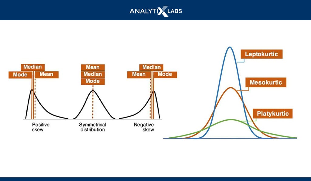
Common symmetrical data distributions include Uniform, Normal (Gaussian), etc.
So, for example, if you come across symmetric-shaped data with a bell-shaped curve, it can be a normal distribution where as per the 3-sigma rule, 68.27% of data falls between one, 95.25% between two, and 99.73% falls between three standard deviations.
Also, the mean, median, and mode are equal for a normal distribution. However, even if the distribution looks normal, one must ensure that the skewness and kurtosis are zero (i.e., the distribution has no abnormal peaks).
Before concluding this article, let’s look at people’s common confusion when understanding EDA, which in reality differs from other Pre-modeling techniques such as Data Preprocessing and Feature Engineering.
Data Pre-processings & Feature Engineering
Exploratory Data Analysis, Data Preprocessing, and Feature Engineering are fundamentally different techiness.
The confusion regarding them comes from all these techniques being performed during the Pre-Modeling stage, and the numerous sub-tasks performed under them often overlap.
Also, these techniques are not always performed one after the other, and it’s common to have a few EDA steps followed by Preprocessing, followed by some more EDA, followed by Feature Engineering, followed by EDA, and so on.
To understand their differences, let’s explore each technique and the tasks performed under them.
-
Exploratory Data Analysis
As already discussed, EDA is used to examine and describe the data you are dealing with. It uses descriptive and inferential statistics along with the use of various graphs to make sense of the data and identify the issues with it.
-
Data Pre-processing
If you would have noticed, in EDA, you always describe the data and identify the issues but never resolve them.
For example, during EDA, you would identify a few irrelevant unnecessary values in a variable; however, it’s under data preprocessing that you manipulate the data and eliminate such values.
Therefore the issues identified in the EDA are tried to be resolved under Data Preprocessing.
Common Preprocessing tasks can include
- Removal of tags and other unnecessary values
- Replacing abbreviations with their more meaningful full forms
- Removal of Stopwords
- Replacing keywords denoting missing value with NULL
-
Feature Engineering
There is a huge overlap between Data Preprocessing and Feature Engineering. In feature engineering, we transform and thereby fundamentally alter the feature. Many of the issues identified in the EDA step are always rectified here.
For example, you may have calculated the mean of a variable and the number of missing values it has during EDA. However, under Feature Engineering, you will perform mean value imputation to plug this issue.
Also, feature engineering is an iterative process as features affect the model’s output, and you must constantly experiment with how you engineer the features to get the optimal result.
The idea behind Feature Engineering is to make the features ready for the model. Common tasks performed under Feature Engineering include-
- Missing Value Treatment (dropping missing values, mean value imputation, etc.)
- Outlier Capping
- Scaling Data (standardization, normalization, min-max, etc.)
- Converting categorical features into numerical features using Label Encoding or One-Hot Encoding
- Derive new Features such as KPIs
- Transforming the dependent variable to make it have a normal distribution
- Feature Reduction (RFE, K-best, Stepwise Regression, etc.)
- Feature Extraction (PCA, LDA, etc.)
Conclusion
EDA is vital in Data Science and is typically the first step when performing data analytics or predictive analytics.
You can perform exploratory data analysis in Python in a non-graphical (statistical) or graphical manner.
An effective EDA allows users to assess the data quality and identify the steps needed during the data preprocessing and feature engineering stage to prepare the predictive model.
Therefore, if you are working or plan to work in data science, you must understand what EDA is and its importance and explore how EDA can be performed.
FAQs
- What is EDA used for?
EDA is used to understand and summarize the data that is to be used for data analytics and predictive analytics.
- What are the types of EDA in Python?
EDA can be divided into non-graphical and graphical. In non-graphical EDA, various descriptive and inferential statistics are performed to understand the data, whereas, in graphical EDA, multiple charts are created to explore the data and describe it.
Each non-graphical and graphical EDA can be further of three types based on the number of variables used- univariate, bivariate, and multivariate.
- What is EDA in coding?
Python and R are typically used for performing EDA, where codes are written to understand the data.
I hope this article helped you understand EDA, its type, typical steps, tools, functions, and libraries to perform it effectively. If you want to know more about EDA or learn languages like Python and R that allow you to perform EDA, write back to us.
Additional Reading Resources