Python has evolved to become engineers’ choice for predictive modeling. It is open source, easy to learn, has a robust community, and has many libraries for data mining and deep learning tasks. One of the most common predictive model algorithms used is logistic regression. Performing logistic regression in Python is easy and scalable. In this article, you will learn how to build an end-to-end logistic regression model in Python.
Other article in the Regression Series:
- Learning Logistic Regression: Theory [Part 1 of this article]
- Logistic Regression in R (with examples)
- Random Forest Regression for Predictive Analysis
Logistic Regression in Python
For the logistic regression in Python example, you must start with a binary classification model using the stroke prediction dataset available on Kaggle. [Data context: Health data to help build a model that will predict the possibility of having a heart stroke for an individual].
The dataset has health information regarding various individuals and whether they had a heart stroke. The idea is to build a classification model based on an individual’s health information and predict whether they will have a stroke.
The data is split so that 95% of the data will be used for training and testing the model, whereas the remaining 5% will act as the serving data.
Note: The dependent variable is removed from this serving data to mimic the scenario where – you use the model on a new dataset where the outcome is unknown.
- Also read: What is Classification in Machine Learning?
AnalytixLabs offers elaborate courses in Data Science and Machine Learning.
All courses come with AnalytixLab’s signature mentor support and job search assistance. For more information on our courses, visit our course page.
The typical stages for building a model using logistic regression in Python are the following-
- Exploratory data analysis
- Model fitting
- Model evaluation
- Data preparation
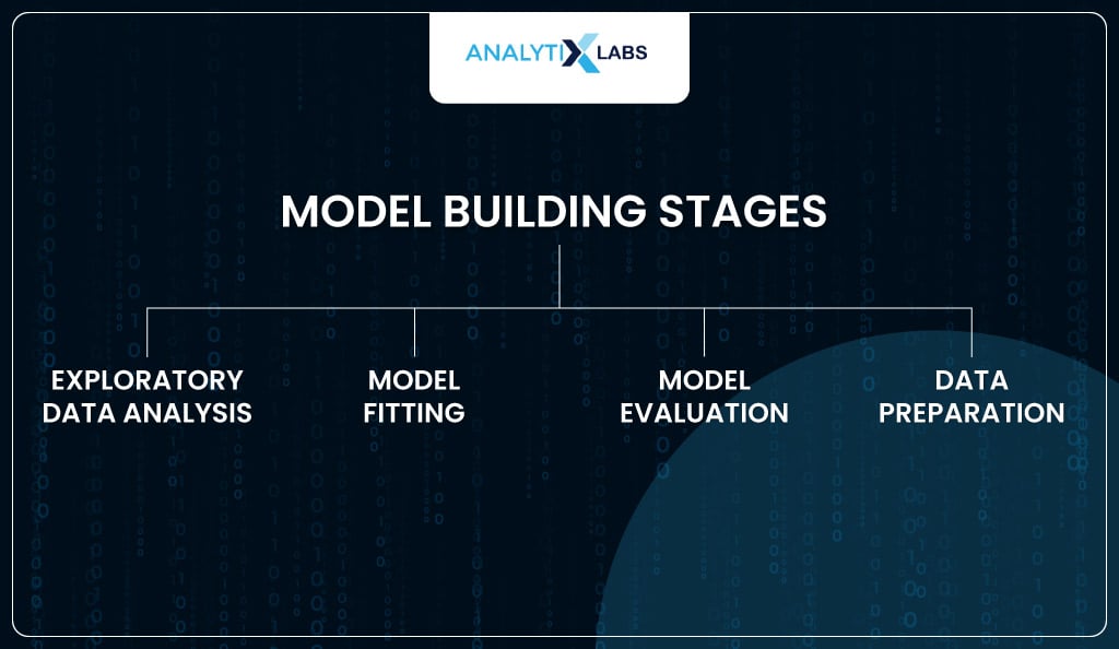
Let’s explore all these stages using Python.
Stage 1: Exploratory Data Analysis (EDA)
The first step in any model-building exercise is to start with EDA. This is where you get to learn some basic information about the data.
- Also read: Exploratory Data Analysis in Python
Importing data
You will start by importing a few basic modules and the dataset.
 # importing basic modules

import pandas as pd

import numpy as np

import matplotlib.pyplot as plt
 # reading data

health_data = pd.read_csv('dataset/stroke/healthcare-dataset-stroke-data_traintest.csv')
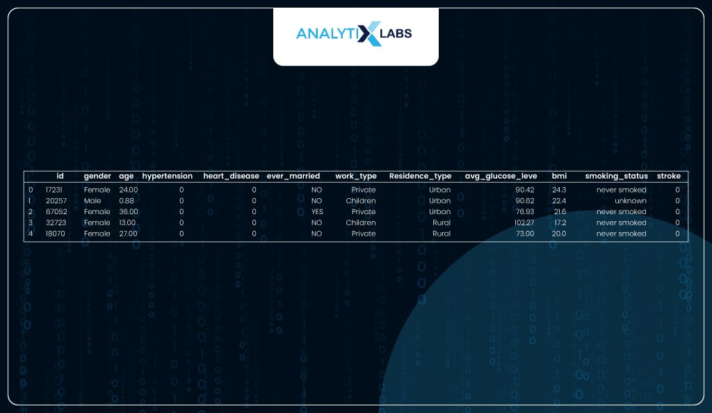
Viewing dataset
The dataset seems to have an id variable, a bunch of independent variables with health and other information about an individual, and a dependent variable, ‘stroke’, indicating whether the individual had a heart stroke, indicated by label 1.
Viewing shape of dataset
The dataset seems to have 12 columns (1 id, 10 independent, and 1 dependent) with information on about 4,854 individuals.
# viewing shape

print('Number of rows are {} | Number of column are {}'\

.format(health_data.shape[0], health_data.shape[1]))
Viewing data type of columns
Next up, you check the data type of the columns. While most columns are numeric, few columns have string data types referred to as ‘object’ in Python pandas. The columns with object data types can be considered categorical.
 # checking the column data types

health_data.dtypes
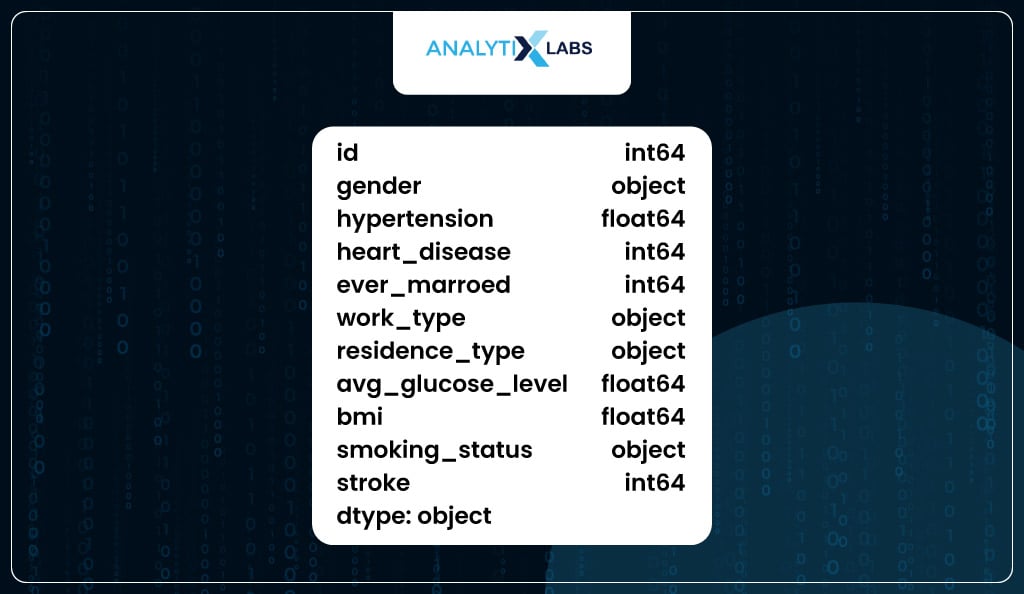
However, it doesn’t mean all columns with ‘int’ or ‘float’ i.e., numeric data types are numerical variables. For example, while columns ‘hypertension’, ‘heart_disease’, and ‘stroke’ have numeric data types, they are categorical in nature as they are binary columns indicating yes or no.
 # checking the unique values of a few numeric columns

# to check if their variable type is numerical or categorical

for i in ['hypertension','heart_disease','stroke']:

print('Unique values in {} are : {}'.\

format(i,health_data[i].unique().tolist()))
Calculating Summary Statistics
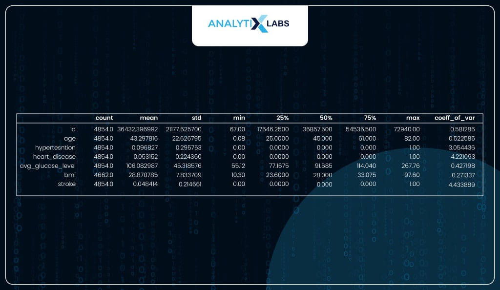
You use the describe function to calculate a bunch of important descriptive statistics. You can manually calculate the coefficient of variation using the standard deviation and mean. No column has a coefficient of variation at or very close to 0, indicating ample variation in the data, which is good.
 # creating summary statistics using describe()

desc_stats = health_data.describe().T
# calculating coefficient of variation

desc_stats['coeff_of_var'] = desc_stats['std'] / desc_stats['mean']
desc_stats
Checking data balance
Ideally, for a binary classification problem, the dependent variable should have an equal number of classes. However, that is usually not the case, especially in problems like heart disease, fraud, or spam detection, where the probability of an event occurring is relatively low.
You need to know if the data is imbalanced, as it can impact how the classes are predicted (which will be discussed later).
In your data, 95% of the individuals don’t have encountered a heart stroke, while only 5% have. Therefore, we are dealing with imbalanced class data.
 # checking label balance

health_data.stroke.value_counts(normalize=True)*100
Now with enough information, let’s start with data cleaning and feature engineering for fitting the model.
Stage 2: Data Preparation
Before the data can be fed into a model, you need to ensure that the data is clean and follows the assumptions required for a logistic regression algorithm. This is what is done in this section.
Dropping redundant variables
To start, you need to drop any redundant variable, i.e., a variable that, without doing many inspections, since it won’t be useful for model development.
[highlight]In our case, the ‘id’ variable can be dropped because it has no predictive properties and indicates the individual’s identity.[/highlight]
 # dropping id variable

df = health_data.drop('id', axis=1)
Checking and imputing missing values
As one of the assumptions of logistic regression, no missing values should exist in the data. In our data, the column ‘bmi’ has missing values.
 # checking for missing values

df.isna().sum()[df.isna().sum()>0]
As the column with the missing value is of variable type numerical, you must perform median value imputation, i.e., replacing the missing value with the median of the column.
 # performing median value imputation

df['bmi'] = df.bmi.fillna(df.bmi.median())
Now there are no columns with missing values.
# re-checking for missing values

df.isna().sum().sum()
Identifying and capping outliers
Another major assumption of logistic regression is that the data should not have abnormally large or small values (outliers). You can a boxplot and identified two columns with major outliers.
# checking for outliers

df.plot(kind = 'box', figsize=(17, 5))
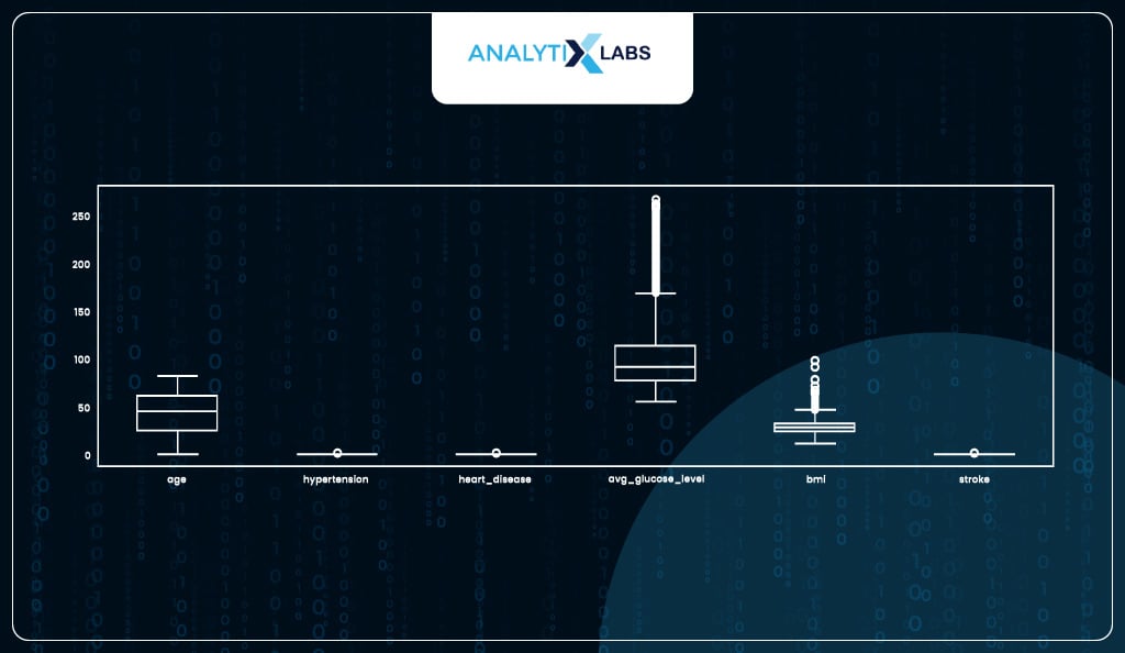
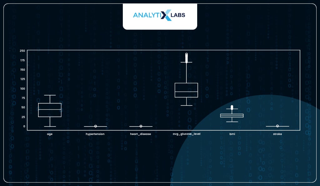
Both columns have upper outliers. As ‘avg_gulucose_level’ has extremely high outliers, we will use its 90th percentile to cap the outliers, whereas for ‘bmi’ where the outliers were relatively mild, we can cap them at the 99th percentile.
 # removing major outliers from avg_glucose_level

p90_avg_glucose_level = df.avg_glucose_level.quantile(0.90)

df.avg_glucose_level.clip(upper = p90_avg_glucose_level, inplace=True)
 # removing major outliers from bmi

p99_bmi = df.bmi.quantile(0.99)

df.bmi.clip(upper = p99_bmi, inplace=True)
After capping the outliers, the box plot seems to indicate that while outliers are still present in both these columns, they are not as extreme as before, and therefore, now you proceed with other preparation steps.
# ensuring that any major outliers are not there

df.plot(kind = 'box', figsize=(17, 5))
Feature Encoding
You must ensure that the data before being fed into a model (especially a logistic regression model) has the data types of all the input features as numeric.
If that is not the case, the model will fail to fit the data. This is where encoding helps, as it converts categorical variables (having string labels) to numerical variables (having numeric labels).
You start this process by dividing your data into one having all the numeric data type columns and the other having all the object data type columns.
 # extracting the numeric data type columns in separate dataframe

num_dtype_cols = df.select_dtypes(include=[np.number]).columns.tolist()

df_num = df[num_dtype_cols]
 # extracting the object data type columns in separate dataframe

object_dtype_cols = df.select_dtypes(exclude=[np.number]).columns.tolist()

df_obj = df[object_dtype_cols]
As you can see, the dataframe having the columns with the ‘object’ data type are all categorical.
# displaying data only having the 'object' data type columns

df_obj
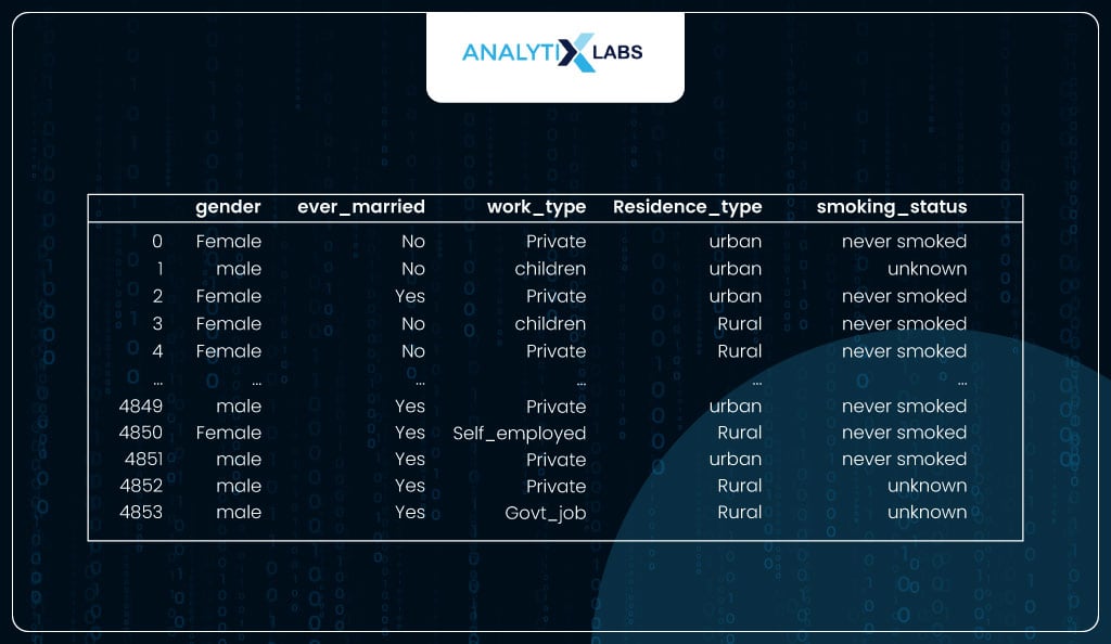
You now perform label encoding on all the columns.
Note: While you are performing label encoding on all the columns, the proper way is to further separate this dataset into data with nominal categorical variables and others with ordinal categorical variables.
The nominal variables should be encoded using one-hot encoding, and the ordinal should be encoded using label encoding.
Here, for simplicity, you can perform label encoding on all the categorical variables.
# label encoding all columns with data type 'object'

from sklearn.preprocessing import LabelEncoder

df_obj = df_obj.apply(LabelEncoder().fit_transform)
As the encoding is done, you combine the categorical variables that now have a numeric data type with the other numerical variables.
# combining all the numeric and object data type columns

df = pd.concat([df_obj, df_num], axis=1)
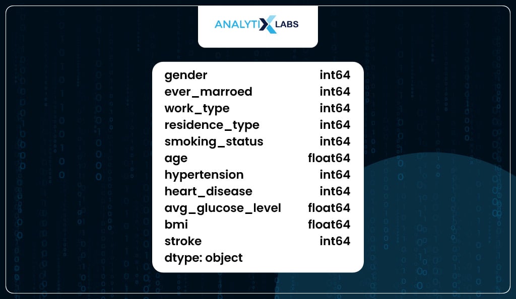
As you can see, all the columns in the data now have a numeric data type.
# ensuring that all data types are numeric

df.dtypes
Feature Importance
An issue with logistic regression is the curse of dimensionality.
It means that if the data has many independent features that do not add to the predictive capability of the data, it becomes difficult for the model to converge.
Therefore, you need to ensure that you can only keep highly important features (important in terms of their predictive capabilities).
To calculate the feature importance, you use an Extra Gradient Boosting Classifier that indicates how well a feature can explain the variance in the dependent variable.
# calculating feature importance

from xgboost import XGBClassifier

from sklearn.model_selection import train_test_split

from sklearn.preprocessing import StandardScaler
# splitting data in train and test

training_features, _, training_labels, _, = train_test_split(

df.drop('stroke', axis=1),

df.stroke, test_size = 0.3,

random_state = 123

)
# scaling data

scaler = StandardScaler()

training_features_scaled = scaler.fit_transform(training_features)
# fitting a tree basec classifier - XGBoost

XGBC_model = XGBClassifier()

XGBC_model.fit(training_features_scaled, training_labels)
# saving the importance score with the column names in a dataframe

importance_df = pd.DataFrame(

data={'feature': training_features.columns,

'importance': XGBC_model.feature_importances_})
# sorting the importance score in descending order

feature_importances = pd.Series(XGBC_model.feature_importances_,

index = training_features.columns)\

.sort_values(ascending = False)
# plotting the importance

feature_importances.plot(kind = 'barh')
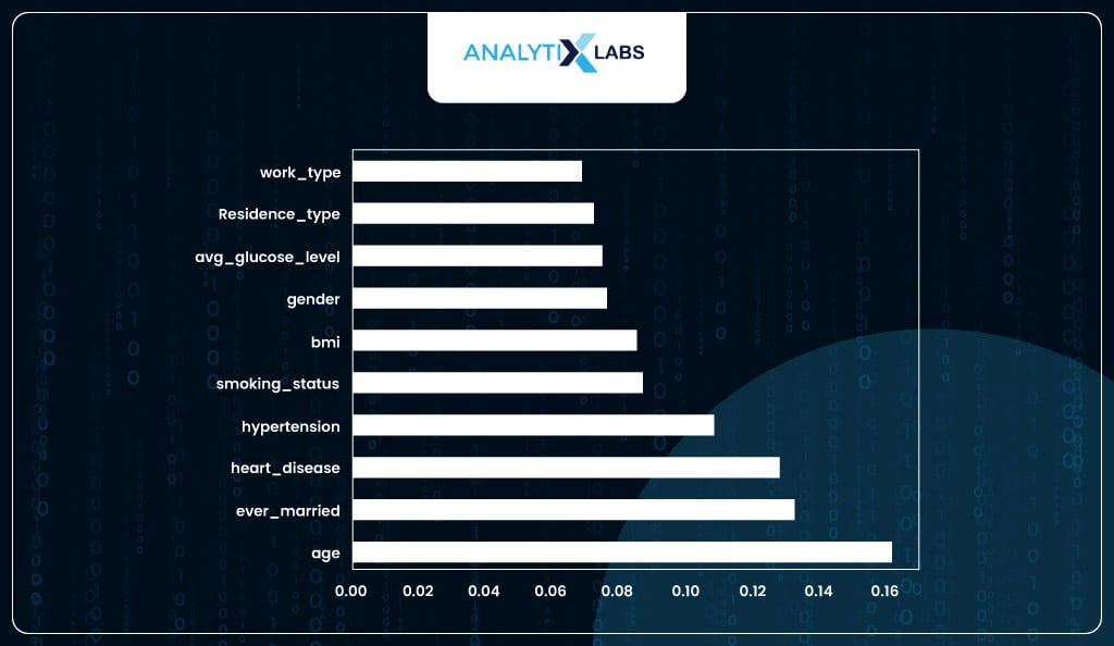
You have selected the top six important features as the feature importance score seems to plateau after the first six important variables.
# extracting the important columns (along with the dependent variable) from the clean data

imp_cols_6 = feature_importances.iloc[0:6].index.tolist()

df = df[imp_cols_6+['stroke']]
Removing multicollinearity
Another major assumption of logistic regression is that there should be no multicollinearity, meaning no independent feature should be related to one or more independent variables.
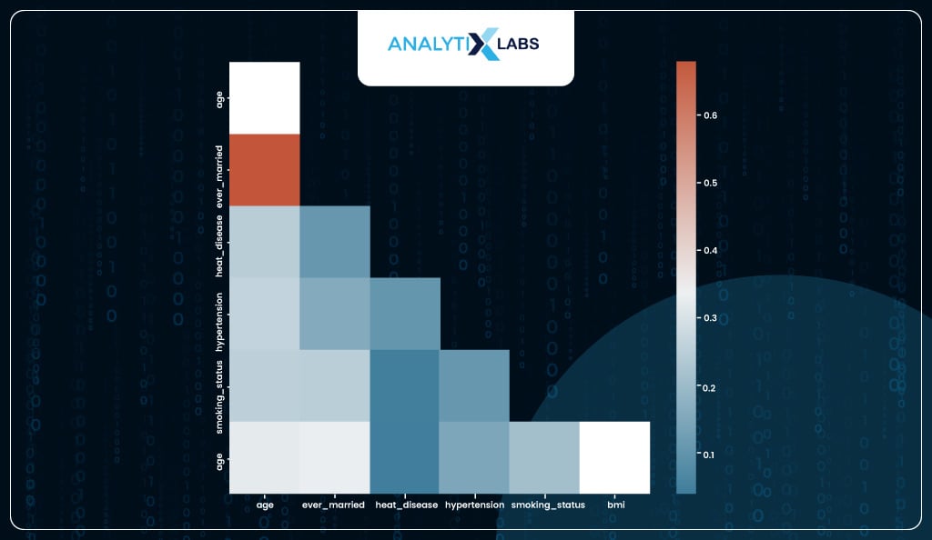
To check for multicollinearity, you can create a correlation matrix, and while it does indicate some individual features that have a high correlation with some other feature, it’s difficult to ascertain which feature to drop to reduce overall levels of multicollinearity.
# checking for correlation among variables

import seaborn as sns

corr = df.drop('stroke',axis=1).corr()

f, ax = plt.subplots(figsize=(12, 10))

mask = np.triu(np.ones_like(corr, dtype=bool))

cmap = sns.diverging_palette(230, 20, as_cmap=True)

sns.heatmap(corr, annot=True, mask = mask, cmap=cmap)
To identify variables causing multicollinearity, one can calculate each column’s Variance Inflation Factor (VIF). The formula for VIF is 1/1-R2.
It indicates how well all the features can predict the feature in question. The high value of VIF indicates that it’s highly related to all other features. While there is a lot of debate on the acceptable value of VIF, one can choose from 2, 5, or 10.
# calculating VIF score for each variable

from statsmodels.stats.outliers_influence import variance_inflation_factor as vif
# saving all the independent features

features = df.drop('stroke', axis=1)
# calculating vif score for each feature

vif_scores = pd.Series(

[vif(features.values, i) for i in range(len(features.columns))]
)
# adding column names to the vif score

vif_scores.index = features.columns
# sorting the vif scores in descending order

vif_scores = vif_scores.sort_values(ascending=False)

vif_scores
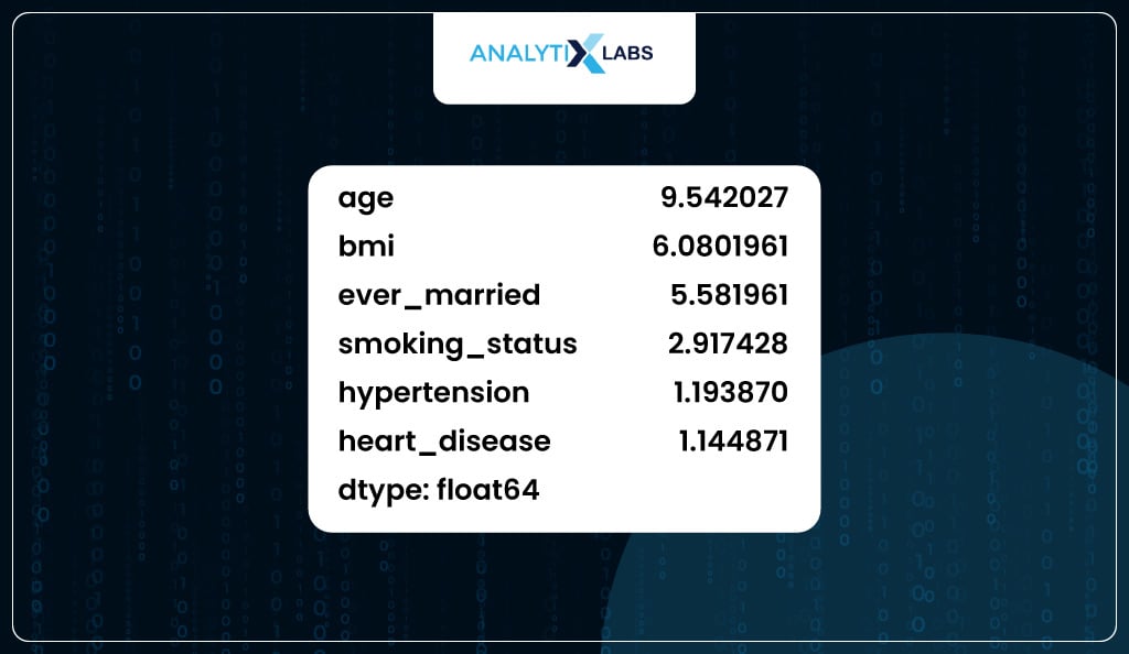
In our case, the column with the highest VIF value is ‘age’; however, you must avoid dropping it as it’s the most important feature, as seen before.
Therefore, you can drop the column with the next highest VIF value, ‘bmi’.
Note – you don’t drop multiple features but only one feature at a time and then recalculate the VIF for each feature using the remaining features.
# removing the column with the second highest VIF score as the column


# with the highest VIF score is highly important

features.drop('bmi', axis=1, inplace=True)
Once ‘bmi’ is dropped, you recalculate the VIF for all the remaining columns. The maximum VIF value encountered now is 6.9, which is somewhat acceptable.
# recalculating VIF score

vif_scores = pd.Series([vif(features.values, i) for i in range(len(features.columns))])

vif_scores.index = features.columns

vif_scores.sort_values(ascending=False)

vif_scores
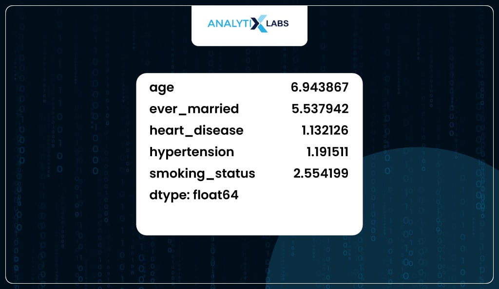
Therefore, now you go ahead and drop the ‘bmi’ variable from the prepared datatset.
# dropping 'bmi' column from the main data

df.drop('bmi', axis=1, inplace=True)
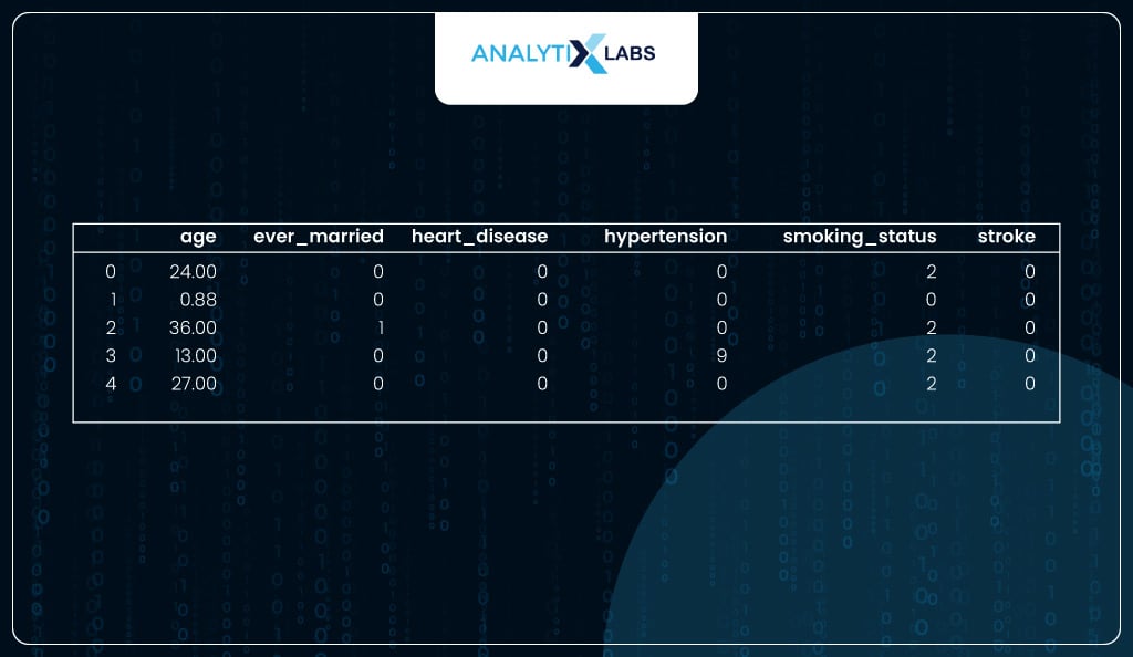
Thus, the final dataset that will be used for fitting the model will have five independent columns.
# saving all the columns to be used for modeling

final_columns = df.columns

final_columns
Stage 3: Model Fitting
It’s time to use the prepared dataset and fit a logistic regression model. There are two ways to develop a logistic regression model in Python– one by using statsmodels and the other by using sklearn. Let’s discuss both.
Statsmodels
When the aim of creating a logistic regression model in Python is to interpret the strength and behavior of features and how they impact the target, then using statsmodels is a better option. Statsmodels provide coefficients, p-values, and a rich model summary report that can be effectively used to interpret the model.
This is because it uses the traditional statistical method instead of the more modern machine learning-esque approach of converting problems into optimization problems as done by sklearn. Thus, for performing logistic regression machine learning, sklearn is best.
Fitting Model
To fit the model, you must ensure that you don’t fit the complete data but only use a portion of the data. Therefore, you split the data into train and test and developed the model using the train data having 70% of the data.
# splitting the data into train and test

train_data, test_data = train_test_split(df, test_size=0.3, random_state=123)
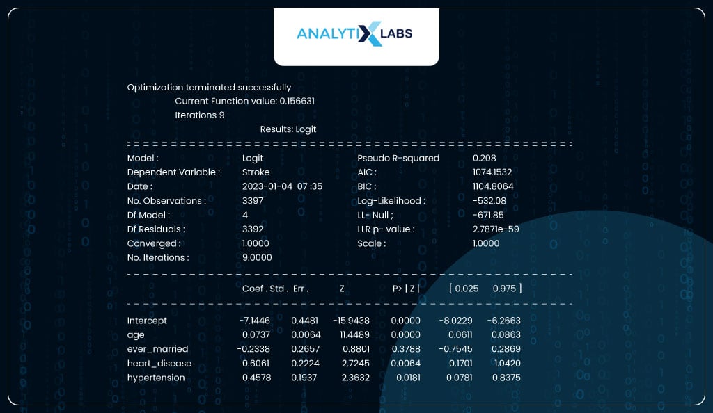
You fit the model by passing the train data and a formula. Here, the formula is y~x1+x2+x3…xn where y is the name of the dependent variable and xn is the independent feature in the data. You can call for a summary report once the model is fitted on the train data. The report shows that the column ‘ever_married’ is not statistically important as its p-value exceeds 0.05.
# fitting logistic regression model using statsmodels

from statsmodels.formula import api as smf
# fitting the model to the train data

model_sm = smf.logit('stroke~age+ever_married+heart_disease+hypertension',

data = train_data).fit()

print(model_sm.summary2())
Interpreting Results
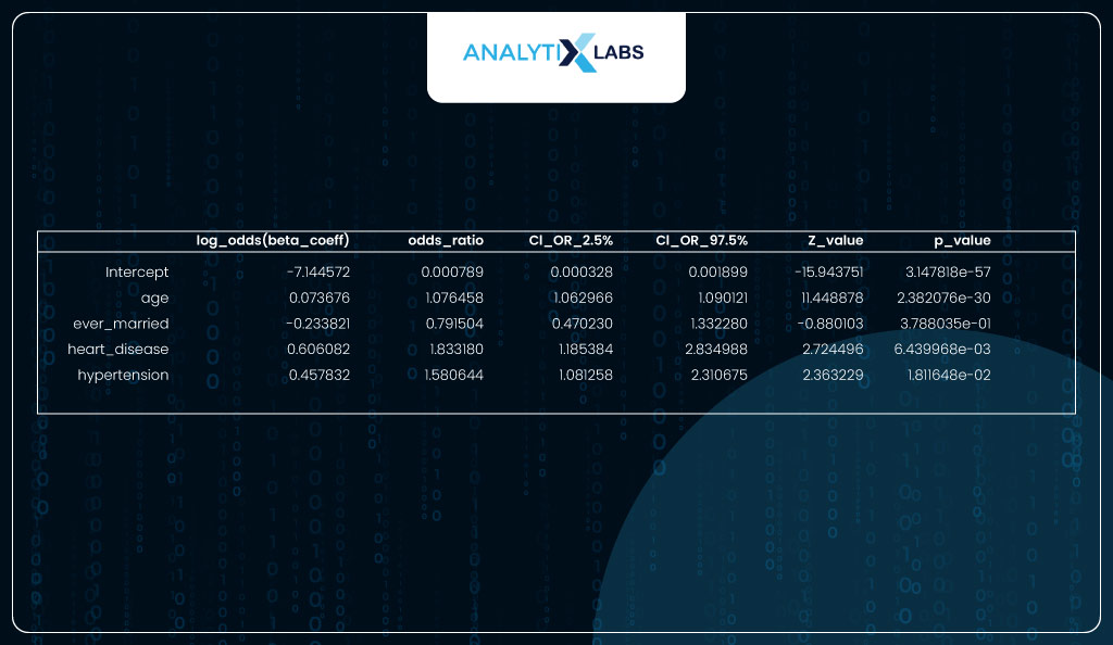
You convert the beta coefficients (log odds) into the odds ratio to better interpret the columns.
As seen in the output below, the most important feature is ‘age’ with the coeff of 0.0737, which means that for every unit increase in age, the log odds of having a heart stroke increase by 0.0737. If we take the exponent of the beta, we get the odds ratio, which means that for every unit increase in age, the odds of having a heart stroke increase by a factor of 1.07.
For a categorical variable like ‘heart_disease’, it means that if an individual has heart disease, there is a 0.6061 increase in the log odds, i.e., when compared to an individual with no heart disease, an individual with heart disease is 1.83 times more likely to have a heart stroke.
# converting the coefficients into odds ratio

coeff_interpret = pd.DataFrame(np.exp(model_sm.params), columns= ['odds_ratio'])

coeff_interpret[['CI_OR_2.5%', 'CI_OR_97.5%']] = np.exp(model_sm.conf_int())

coeff_interpret['z_value']= model_sm.tvalues

coeff_interpret['p_value']= model_sm.pvalues

coeff_interpret['log_odds(beta_coeff)']=model_sm.params

coeff_interpret = coeff_interpret.loc[:,['log_odds(beta_coeff)','odds_ratio',

'CI_OR_2.5%', 'CI_OR_97.5%','z_value','p_value']]
coeff_interpret
Sklearn
Suppose you focus less on interpretability and more on getting the predictions out and addressing problems like overfitting. In that case, you should create a logistic regression model using sklearn. Sklearn is the best library in Python if you intend to perform logistic regression machine learning.
Fitting Model
Here also, you split the data into train and test so the model is developed on the training dataset and is evaluated on the test dataset.
# splitting the data into train features and labels and test features and labels

X_train, X_test, y_train, y_test = train_test_split(df.drop('stroke',axis=1),

df.stroke,

test_size=0.3,

random_state = 123)
You can use sklearn to fit the logistic regression model. Unlike statsmodels, it has built-in regularization methods which use penalties like ridge (l2) and lasso (l1) to address the problem of overfitting.
# fitting logistic regression model using sklearn

from sklearn.linear_model import LogisticRegression
# initializing logistic regression model

logreg = LogisticRegression(random_state=123, max_iter = 10000, penalty='l2')
# fitting model to the train data

model = logreg.fit(X_train, y_train)
Predicting probabilities and classes
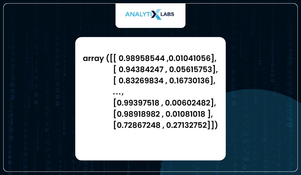
You have used the model to predict the test dataset. When using a logistic regression model in Python, you can use the predict_proba function that returns the predicted probabilities. Here on the left, you have the probability of the observation belonging to class 0 (healthy), while on the right, the probability is of being to class 1 (stroke).
# predicting for the test data

model.predict_proba(X_test)
You can use the predict function, which converts the predicted probabilities into classes such that it returns 1 when the probability is above 0.5 and 0 when it’s below 0.5.
# predicting classes

model.predict(X_test)
If the model’s performance is low with the training dataset, it’s considered underfitting. However, it is overfitting if the model performs good with the training data but poorly with the test data. Therefore, properly evaluating a model requires predicting the training and test data.
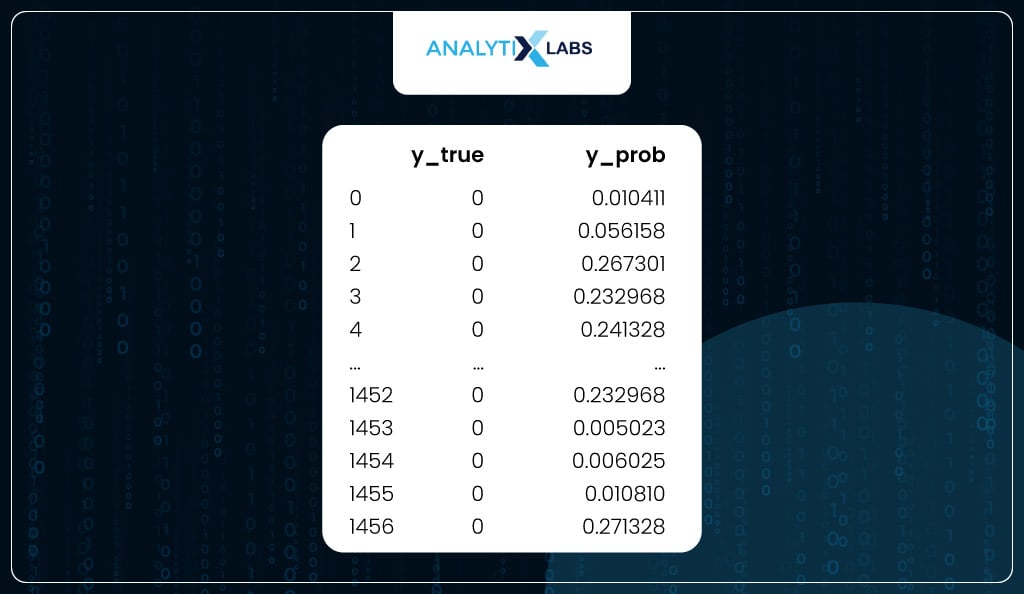
Below, you use the model to predict probabilities using the train and test dataset and create two datasets. One dataset has the actual labels (dependent variable) and the predicted probabilities of the train, and another one of the test.
# predicting and saving the probability for the positive class with the actual classes

train_scores = pd.concat([

pd.Series(y_train, name='y_true').reset_index(drop=True),

pd.Series(model.predict_proba(X_train)[::,1],

name='y_prob').reset_index(drop=True)

],axis=1)

test_scores = pd.concat([

pd.Series(y_test, name='y_true').reset_index(drop=True),

pd.Series(model.predict_proba(X_test)[::,1],

name='y_prob').reset_index(drop=True)

],axis=1)
You now have a dataset with the training data’s dependent variable (y_true) and predicted probabilities (y_prob).
# viewing train scores

train_scores

Similarly, another dataset is where you have y_true and y_prob for the test data.
# viewing test scores

test_scores
Model Evaluation
The performance of the logistic regression machine learning model in Python can be calculated in two ways. One uses methods that use the actual classes (y_true) and the predicted probabilities (y_prob), and another one uses actual classes (y_true) and the predicted classes (y_pred). While the former has methods like ROC Curve, Calibration Plot, Decile Analysis, KS statistic, Lift and Gain chart, the latter has performance metrics like precision, recall, f1 score, etc.
Probability-based Performance Metrics
Let’s first start with the evaluation methods that depend on the predicted probabilities.
-
ROC Curve
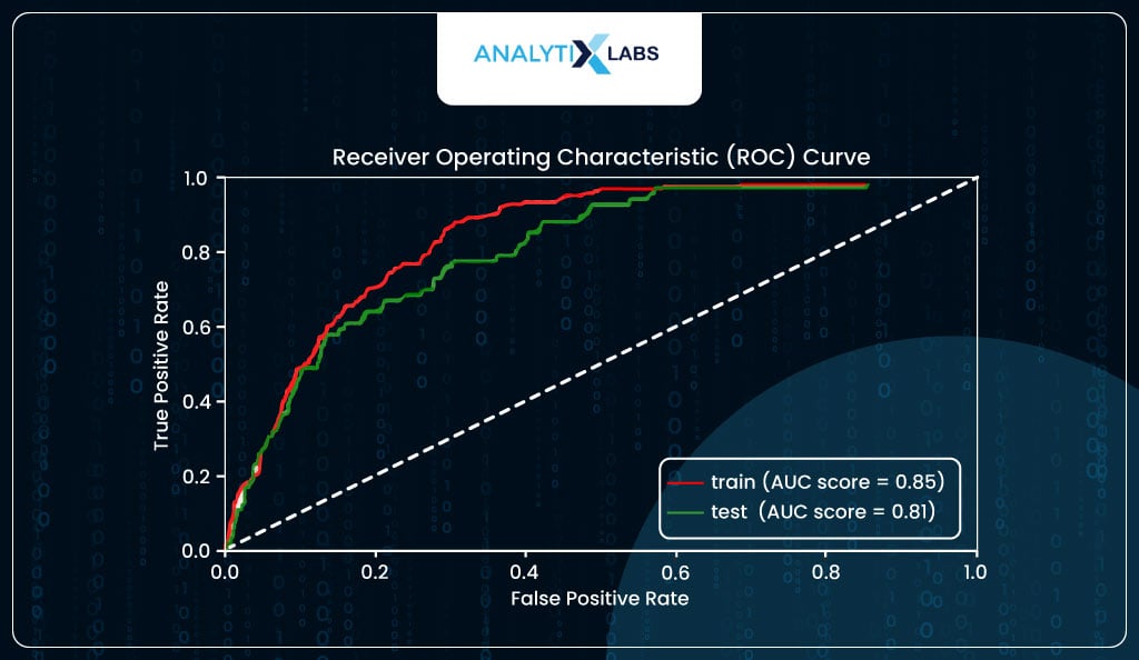
ROC Curve plots the True Positive Rate (TPR/Sensitivity) and True Negative Rate (TNR/Specificity). As it’s difficult to plot these two as it is to from a curve, we use False Positive Rate (FPR), which is 1-TNR instead of TNR. Ideally, the area under the curve (AUC) should be high, i.e., the cumulative correctly predicted positives and negatives should be high. The curve has an elbow at the point where TPR is equal to TNR.
As you can see below, in your case, the AUC score for the train data is a decent 85%, indicating that the model is not underfitting. At the same time, it is 81% for the test, which is not a massive drop, indicating that the model is not overfitting and generalizing well.
# creating a ROC curve

from sklearn import metrics
# Data for ROC curve train

fpr_train, tpr_train, threshold_train = \

metrics.roc_curve(train_scores.y_true, train_scores.y_prob)

roc_auc_train = metrics.auc(fpr_train, tpr_train)
# Data for ROC curve test

fpr_test, tpr_test, threshold_test = \

metrics.roc_curve(test_scores.y_true, test_scores.y_prob)

roc_auc_test = metrics.auc(fpr_test, tpr_test)
# setting the figure size

plt.figure(figsize=(7, 3.5))
# creating the two plots

plt.plot(fpr_train, tpr_train, 'r', label = 'train (AUC score = %0.2f)' % roc_auc_train)

plt.plot(fpr_test, tpr_test, 'g', label = 'test (AUC score = %0.2f)' % roc_auc_test)
# setting the title, legend, labels etc.

plt.title('Receiver Operating Characteristic (ROC) Curve')

plt.legend(loc = 'lower right')

plt.plot([0, 1], [0, 1,],'k--')

plt.xlim([0, 1])

plt.ylim([0, 1])

plt.ylabel('True Positive Rate')

plt.xlabel('False Positive Rate')

plt.show()
-
Calibration Curve
The logistic regression algorithm predicts probabilities for an event. In your case, it predicts the probability of a person having a heart stroke (event). The concept of calibration dictates that if a few individuals get around a predicted probability of 0.3, 30% of them will suffer from a stroke. If that is not the case, then the model is either underpredicting or overpredicting and hence is not calibrated.
Plots like probability calibration curves (also known as reliability diagrams) help you visualize and understand how well calibrated, i.e., reliable are the model’s predicted probabilities. The plot is created by having the predicted probabilities in ten groups, such as the first group being 0 to 0.1, the second being 0.1 to 0.2, the third being 0.2 to 0.3, and so on, with the last being 0.9 to 1. The x-axis has the average predicted probability in each group, while the y-axis has the ratio/proportion of actual positives (also known as the empirical probability).
Ideally, a well-calibrated model should follow a linear straight (diagonal) line. Suppose the model is above the diagonal line. In that case, it indicates that the probabilities are too small and the model is underpredicting (underestimating). In contrast, if it’s below the diagonal line, the probabilities are too large, and the model is overpredicting (overestimating).
from sklearn.calibration import calibration_curve

# saving data for calibration plot using train data

xaxis_train, yaxis_train = calibration_curve(train_scores.y_true, train_scores.y_prob,

n_bins = 10, normalize = False,

strategy='uniform')
# saving data for calibration plot using test data

xaxis_test, yaxis_test = calibration_curve(test_scores.y_true, test_scores.y_prob,

n_bins = 10, normalize = False,

strategy='uniform')
# setting figure size

plt.figure(figsize=(7, 3.5))
# creating calibration plots

plt.plot(yaxis_train, xaxis_train, "r-",label="%s" % ('train', ))

plt.plot(yaxis_test, xaxis_test, "g-",label="%s" % ('test', ))
# setting title, legends, labels etc.

plt.title('Calibration Curve')

plt.ylabel ('Ratio of Positives')

plt.xlabel('Average Predicted Probability in each bin')

plt.plot([0, 1], [0, 1], "k--", label="Ideal Calibration")

plt.ylim([-0.05, 1.05])

plt.legend(loc="lower right")

plt.tight_layout()

plt.show()
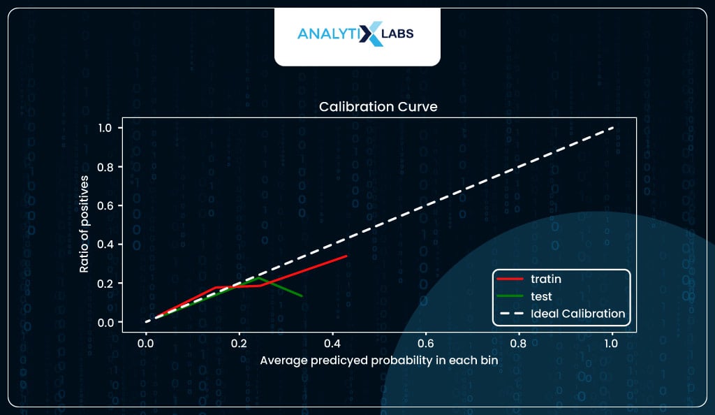
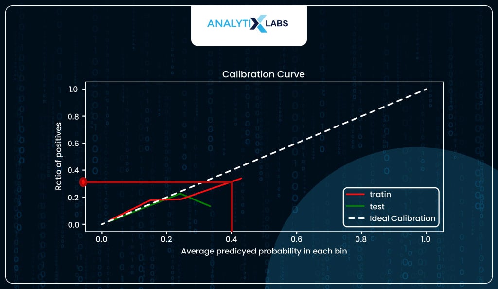
In our case, the model seems to be calibrated to a certain degree but overpredicting for the higher probabilities.
For example, when the predicted probability is around 0.4, you expect around 40% of individuals with such a predicted probability to suffer from stroke, whereas, in reality, roughly 30% did.
The calibration curve also indicates the predicted probabilities are not well distributed, with the maximum predicted probability for training data tapering off at around 50%, while for the test, it’s just at around 40%.
However, this should not be a problem as it is to be expected because you are dealing with imbalanced class data that impacts the estimate of the model intercept, causing the probabilities to skew. You should be good if you keep this information in mind when converting the probabilities into classes.
print('range of predicted probability in train data: {} to {}'.\

format(round(min(train_scores.y_prob),2),round(max(train_scores.y_prob),2))

)

print('range of predicted probability in test data: {} to {}'.\

format(round(min(test_scores.y_prob),2),round(max(test_scores.y_prob),2))

)
-
Decile Analysis
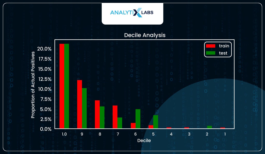
The next important method to evaluate the logistic regression model is decile analysis. The predicted probabilities are sorted into ten equal groups (deciles). The proportion of actual positives (y_true==1) is then calculated in each decile and plotted on the y-axis, with the decile number on the x-axis.
Ideally, such a graph should follow a staircase pattern, i.e., the number of captured positive labels is high for higher deciles (i.e., where the predicted probability is high), and this ratio of positives should gradually come down as you move down the deciles.
Fortunately, in your case, you do see a staircase-like pattern for both train and test.
# saving data for decile plot using train data

cr_train, _ = calibration_curve(train_scores.y_true, train_scores.y_prob,

n_bins = 10, normalize = False,

strategy='quantile')
# saving data for decile plot using test data

cr_test, _ = calibration_curve(test_scores.y_true, test_scores.y_prob,

n_bins = 10, normalize = False,

strategy='quantile')
# creating dataframe to compare the decile data train vs. test

decile_comparison = pd.concat([pd.Series(np.flip(np.arange(1,11)),name='decile'),

pd.Series(cr_train, name='train'),

pd.Series(cr_test, name = 'test')],axis=1)
# sorting the data by decile

decile_comparison = decile_comparison.sort_values(by='decile')

decile_comparison = decile_comparison.reset_index(drop = True)
# making the decile lables to be 10 to 1

decile_comparison.decile = np.flip(np.arange(1,11))
# creating decile plot

decile_comparison.plot.bar(x='decile', stacked=False,

subplots=False, figsize=(7,3.5), color=['r','g'])
# setting title, lavbels etc.

plt.title('Decile Analysis')

plt.xlabel('Decile')

plt.ylabel('Proportion of Actual Positives')

plt.xticks(rotation='horizontal')

import matplotlib.ticker as mtick

plt.gca().yaxis.set_major_formatter(mtick.PercentFormatter(xmax=1.0))

plt.show()
-
KS Statistic
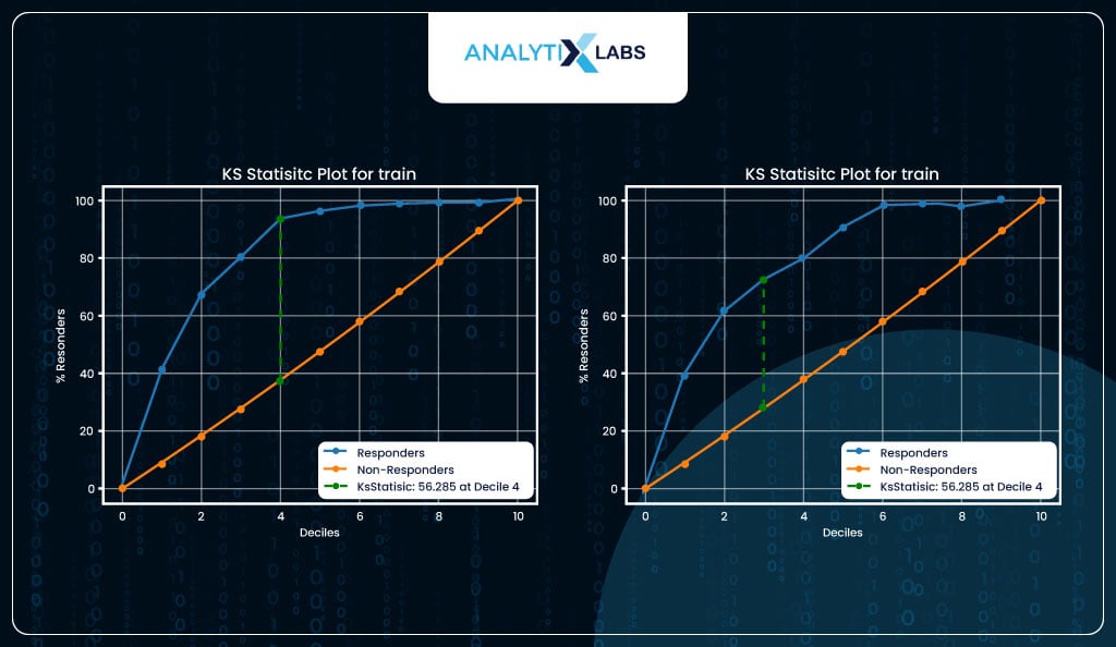
KS statistic helps to measure the separation between the positive and negative classes. Here, too, just like decile analysis, the probabilities are binned into ten equal groups, and the proportion of actual positives (y_true==1) and actual negatives (y_true==0) is calculated and plotted on the y-axis. Ideally, we should see a significant separation in the initial few deciles.
The KS statistic is computed by finding the separation at its maximum. In your case, you see a good value of KS statistic of 56 and 44 for train and test, respectively, in the initial few deciles. Your logistic regression model can properly differentiate and discriminate between the two classes.
import kds

# setting plot size

plt.subplots(figsize=(15, 5))
# plotting KS Statistic curve for train

plt.subplot(1, 2, 1)

kds.metrics.plot_ks_statistic(train_scores.y_true, train_scores.y_prob,

title='KS Statistic Plot for train')
# plotting KS Statistic curve for test

plt.subplot(1, 2, 2)

kds.metrics.plot_ks_statistic(test_scores.y_true, test_scores.y_prob,

title='KS Statistic Plot for test')
-
Lift Chart
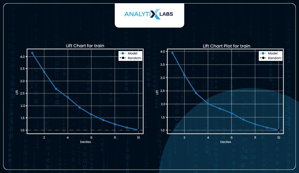
Calculating a lift is a great way to evaluate a logistic regression model. Lift indicates how much better the model performs than a random model. For example, suppose you have a dataset with 10,000 observations where the total number of events is 100 and pick 1,000 random observations (10% of data). In that case, you can expect to capture ten events (10% of events).
If you create a model and pick 10% of data where the predicted probability (of the event happening) is highest and capture 40 events, then this would mean that you have a lift of 4.
In other words, you can expect four times the total number of events found by randomly selecting 10% of the data. With your model, you can achieve (both for train and test data) a lift>3 in the initial deciles, and some lift maintains till the last decile, indicating that the model is performing well.
# setting plot size

plt.subplots(figsize=(15, 5))
# plotting Lift chart for train

plt.subplot(1, 2, 1)

kds.metrics.plot_lift(train_scores.y_true, train_scores.y_prob,

title='Lift Chart for train')
# plotting Lift chart for test

plt.subplot(1, 2, 2)

kds.metrics.plot_lift(test_scores.y_true, test_scores.y_prob,

title='Lift Chart Plot for test')
-
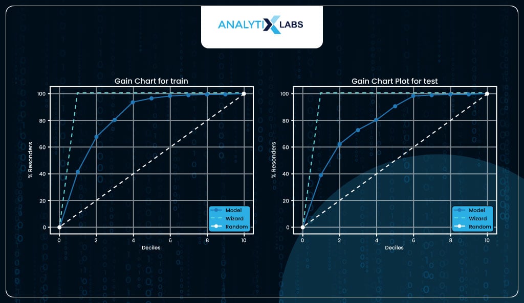
Gain Chart
The gain chart is another way of visualizing lift.
# setting plot size

plt.subplots(figsize=(15, 5))
# plotting Gain chart for train

plt.subplot(1, 2, 1)

kds.metrics.plot_cumulative_gain(train_scores.y_true, train_scores.y_prob,

title='Gain Chart for train')
# plotting Gain chart for test

plt.subplot(1, 2, 2)

kds.metrics.plot_cumulative_gain(test_scores.y_true, test_scores.y_prob,

title='Gain Chart Plot for test')
Class-based Performance Metrics
So far, all the evaluation methods discussed involved the actual labels (y_true) and the predicted probabilities (y_prob). It’s time now to calculate the various class-based performance metrics. These metrics required the actual labels (y_true) and the predicted labels (y_pred) to calculate some form of performance. All these metrics rely on four outcomes-
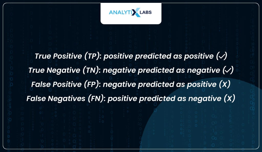
These four outcomes are the values you will later see in a confusion matrix.
Ideally, you want the TP and TN to be the highest, but there is always a trade-off. For example, if you set an extremely low probability as a threshold, all observations will be predicted as positives, causing TP to go up but TN to come down and FP to go up. Therefore, one needs to strike a balance between the two by optimizing the threshold.
Predicting and Evaluating classes using default threshold
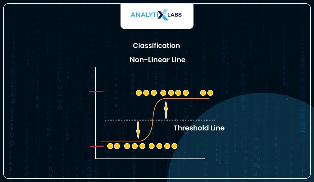
To understand all this, let’s first use the default threshold of 50% used by sklearn to predict the classes and calculate various performance metrics. You must know that, unlike a few algorithms like SVM, the logistic regression algorithm doesn’t naturally come up with classes. Instead, it predicts probabilities, which need to be converted into classes.
# predicting classes for train and test

train_scores['y_pred'] = model.predict(X_train)

test_scores['y_pred'] = model.predict(X_test)
You create a user-defined function that calculates various class-based performance metrics. Here, you require the y_true and y_pred, through which you create a confusion matrix and find the TP, TN, FP, and FN. You then use these values to calculate the various performance metrics.
import warnings

def performance_metrics(y_true: pd.Series,

y_pred: pd.Series,

set_col_name: str = 'score') -> pd.DataFrame:

"""Calculates class based performance metrics."""

warnings.filterwarnings('ignore')
# calculating confusion matrix

cm = metrics.confusion_matrix(y_true, y_pred)
# extracting outcomes from confusion matrix

tp = cm[1][1] ; tn = cm[0][0]
fp = cm[0][1] ; fn = cm[1][0]
fp = fp.astype(float) ; fn = fn.astype(float)

tp = tp.astype(float) ; tn = tn.astype(float)
# calculating important performance matrix

tpr = tp/(tp+fn)

tnr = tn/(tn+fp)

npv = tn/(tn+fn)

fpr = fp/(fp+tn)

fnr = fn/(tp+fn)

fdr = fp/(tp+fp)

accuracy = (tp + tn) / (tp + tn + fp + fn)

balanced_accuracy = (tpr + tnr) / 2

precision = tp / (tp+fp)

f1 = 2 * (precision * tpr) / (precision + tpr)
# saving the name of the performance metrics

metric_names = ['accuracy', 'balanced_accuracy',

'true positive rate (recall/sensitivity)',

'true negative rate (specificity)',

'false positive rate',

'false negative rate',

'precision (positive predictive value)',

'negative predictive value',

'false discovery rate', 'f1 score']
# rounding off all metrics to 2 decimal places

class_metrics = pd.Series([round(accuracy,2),

round(balanced_accuracy,2), round(tpr,2),

round(tnr,2), round(fpr,2), round(fnr,2),

round(precision,2), round(npv,2),

round(fdr,2), round(f1,2)

],name=set_col_name)
# returning output

class_metrics.index = metric_names

return(class_metrics)
You now use the above function to calculate the performance metrics on the train dataset.
# Using the function to calculate performance metrics for train data

performance_metrics(y_true= train_scores.y_true,

y_pred = train_scores.y_pred,

set_col_name = 'score')
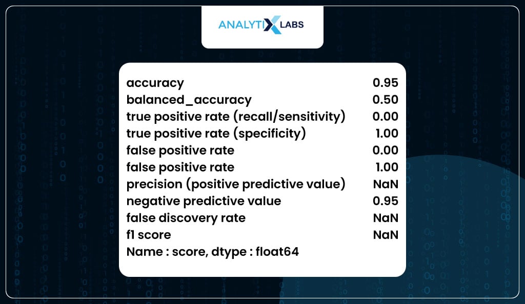
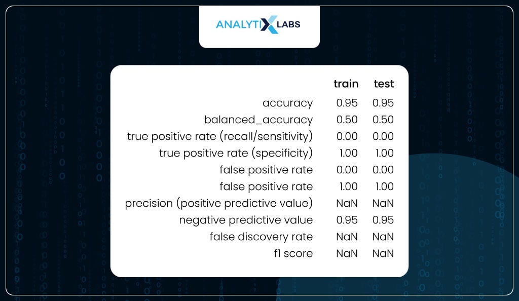
To check for overfitting, you can use the user-defined ‘performance_metrics’ function to calculate the class-based metrics on train and test and combine them in a single dataframe. As the difference between the values of the train and test are not substantially different, it can be said that the model is not overfitting.
# calculating performance metrics for train and test

train_metrics = performance_metrics(y_true= train_scores.y_true,

y_pred = train_scores.y_pred,

set_col_name = 'train')
# calculating performance metrics for test

test_metrics = performance_metrics(y_true= test_scores.y_true,

y_pred = test_scores.y_pred,

set_col_name = 'test')
# combining the data

train_test_metrics = pd.concat([train_metrics, test_metrics], axis=1)
# viewing the data

train_test_metrics
Optimizing Threshold
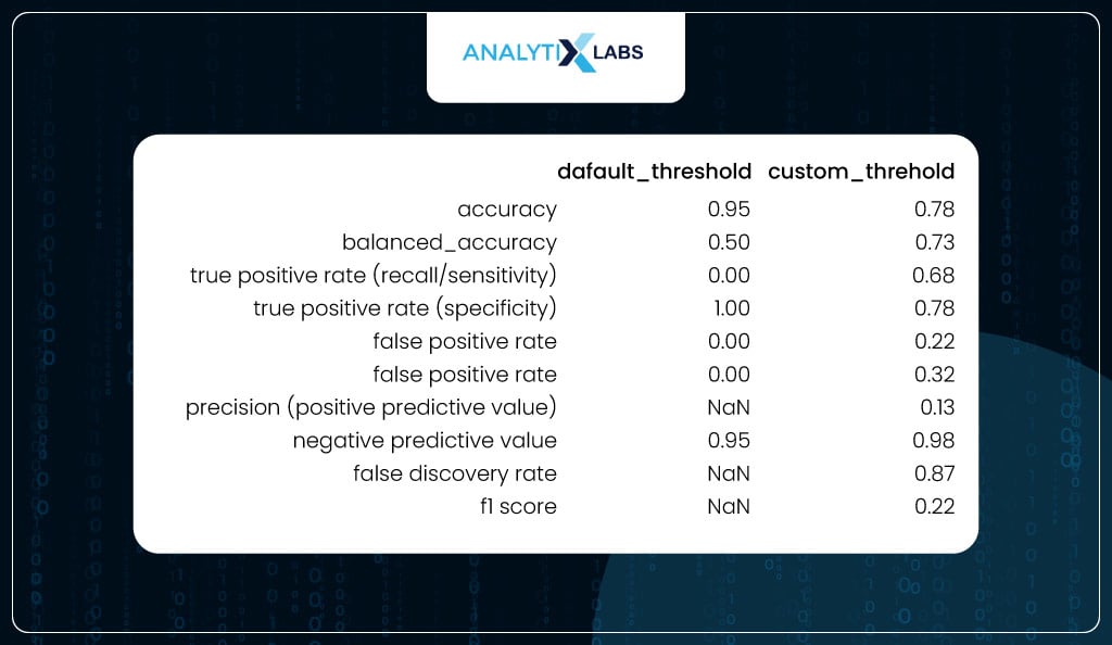
If you carefully see the table above, you will realize that there is something off about the output. For example, while specificity is 100%, recall is 0%. This is because the class produced by using the default threshold of 50% is incorrect. This, anyway, is obvious from the fact that the data is imbalanced, and therefore, the correct threshold needs to be found as it currently is extremely high, causing all the classes to be predicted as 0.
Therefore, you optimize the threshold to find the probability value where the true positive rate (TPR) and true negative rate (TNR) are equal. If you recall the ROC curve, we plotted TPR and (indirectly) TNR, where the elbow is where the TPR = TNR. This concept can be written as
TPR = 1 – FPR
It’s because 1-FPR is another way of saying TNR.
Therefore, you want to find the threshold where True Positive Rate (TPR) equals 1 minus False Positive Rate (FPR). When there’s a root-finding problem, it is converted into an optimization problem to find the minimum value. In this case, your loss function that you want to minimize is-
p = arg min | TPR + FPR -1
This is exactly what you will do below-
# finding better threshold


# extracting the true positive rate (sensitivity) and


# false positive rate (specificity) for different thresholds (probabilities)

fpr, tpr, thresholds = metrics.roc_curve(train_scores.y_true,

train_scores.y_prob,

drop_intermediate=False)
# setting the loss function

loss = np.abs(tpr+fpr-1)
# finding minimum loss

min_loss = np.argmin(loss)
# extracting the threshold where the loss is minimum

optimized_threshold = thresholds[min_loss]
optimized_threshold
Here, the threshold probability is around 5%, which is to be expected as the total number of positive classes in our data is around 5%. If you were to visualize this optimization process, it would look something like-
def optimum_threshold_finder(y_true_train: pd.Series, y_prob_train: pd.Series,

display_graph: bool = False, method: str = 'roc'):

"""Finds the best threshold for converting the predicted

probabilities into binary classes.

"""

import pylab as pl

if method == 'roc':

fpr, tpr, thresholds = metrics.roc_curve(y_true_train,

y_prob_train,

drop_intermediate=False)

cost_function = np.argmin(np.abs(fpr+tpr-1))

best_threshold = thresholds[cost_function]
if display_graph==True:

plt.scatter(thresholds,np.abs(fpr+tpr-1), s=5,

facecolors='#008080')

pl.title('Best Threshold - Maximizing TPR and TNR')

plt.xlabel("Threshold")

plt.ylabel("|TPR + FPR - 1|")

plt.scatter(best_threshold, min(np.abs(fpr+tpr-1)),

facecolors='red', marker = 'o')

plt.text(best_threshold, min(np.abs(fpr+tpr-1)), \

f'{"   the optimum threshold: "}{round(best_threshold,3)}')

plt.axvline(x=1, ymin=0.0, ymax=1, color='black', ls=':', lw=1)

plt.scatter(max(thresholds), max(np.abs(fpr+tpr-1)),

facecolors='blue', edgecolor="orange", s=10)

plt.show()

return(best_threshold)

elif method =='accuracy':

threshold = []
accuracy = []
for p in np.unique(y_prob_train):

threshold.append(p)

pred_val = (y_prob_train >= p).astype(int)

accuracy.append(metrics.balanced_accuracy_score\

(y_true_train,pred_val))

best_threshold = threshold[np.argmax(accuracy)]
if display_graph==True:

plt.scatter(threshold,accuracy, s=5, facecolors='#008080')

plt.scatter(best_threshold, max(accuracy), facecolors='red', marker = 'o')

plt.text(best_threshold, max(accuracy),  \

f'{"   the optimum threshold: "}{round(best_threshold,3)}')

pl.title('Best threshold - Maximizing Balanced Accuracy')

plt.xlabel("Threshold")

plt.ylabel("Balanced Accuracy")

plt.show()

return(best_threshold)

else:

raise ValueError('Invalid Argument: method parameter must be set to either "roc" or "accuracy"')
# visualizing optimum threshold using roc method

optimum_threshold_finder(y_true_train = train_scores.y_true,

y_prob_train = train_scores.y_prob,

display_graph = True, method = 'roc')
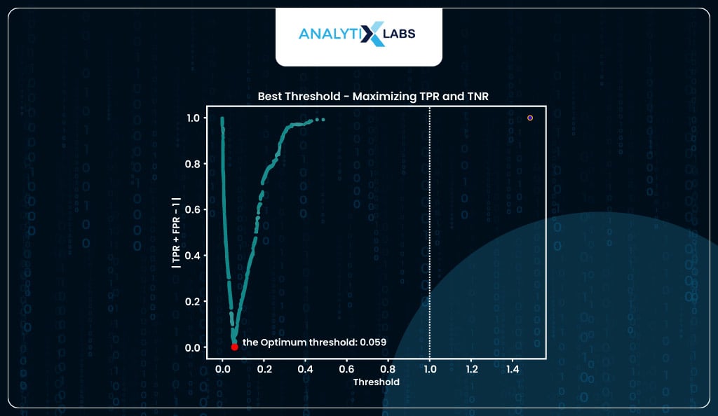
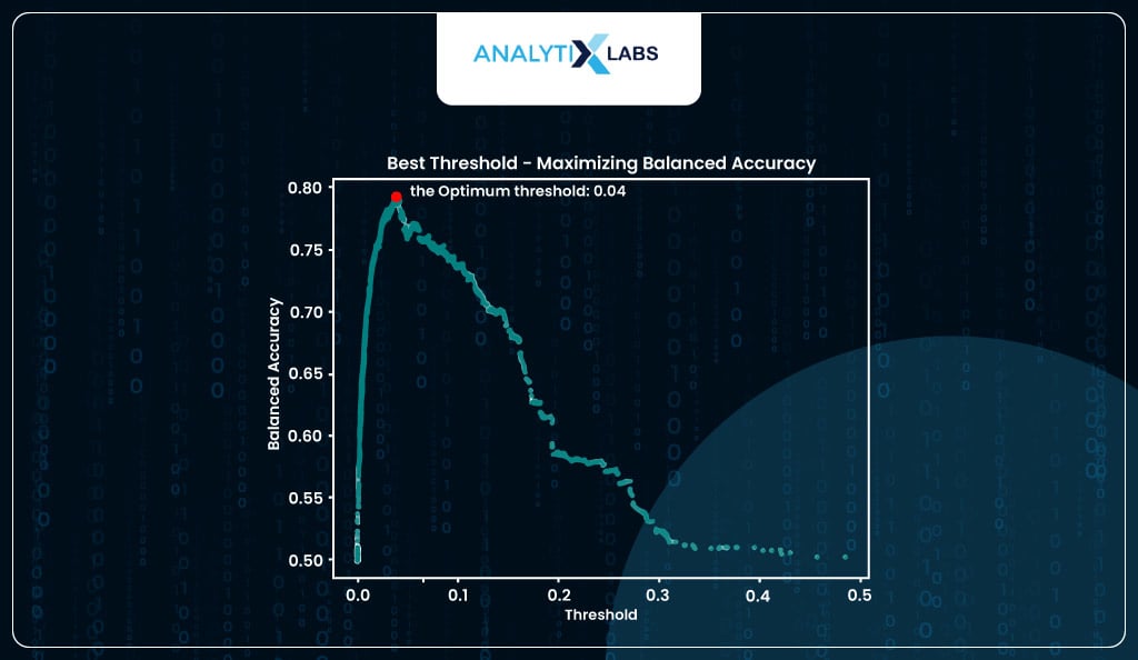
If you want, you can find the optimum threshold by using balanced accuracy where that value of predicted probability is considered where the balanced accuracy is at its maximum (I, however, will be using the threshold provided by the roc method).
# visualizing optimum threshold using balanced accuracy method

optimum_threshold_finder(y_true_train = train_scores.y_true,

y_prob_train = train_scores.y_prob,

display_graph = True, method = 'accuracy')
Predicting and Evaluating classes using Optimized Threshold
Now that you have an optimized threshold, you again predict the classes manually, where any value above the threshold returns label 1, and otherwise, it’s labeled as 0. Below, you use the new optimized threshold to convert the probabilities into classes for the training and testing datasets.
# converting probabilities of train to classes

train_scores['y_pred_new'] = train_scores.y_prob\

.map(lambda x: 1 if x > optimized_threshold else 0)
# converting probabilities of test to classes

test_scores['y_pred_new'] = test_scores.y_prob.\

map(lambda x: 1 if x > optimized_threshold else 0)
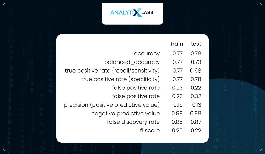
You again calculate the class-based performance metrics for training and testing data using the predicted classes created using the new optimized threshold. If you notice, now the values are much more balanced.
For the train data, the sensitivity and specificity are equal, as expected (because the threshold was found by calculating the probability where both these metrics were equal).
At the same time, there is a good balance between the two metrics for the test. Other important metrics like FPR and FNR are low. Also, there is not much difference between the values of the train and test, indicating that the model is not overfitting.
# calculating performance metrics for train

train_metrics2 = performance_metrics(y_true= train_scores.y_true,

y_pred = train_scores.y_pred_new,

set_col_name = 'train')
# calculating performance metrics for test

test_metrics2 = performance_metrics(y_true= test_scores.y_true,

y_pred = test_scores.y_pred_new,

set_col_name = 'test')
# combining the data

train_test_metrics2 = pd.concat([train_metrics2, test_metrics2], axis=1)
# viewing the data

train_test_metrics2
To appreciate the impact of using the optimized threshold, you calculate all the class-based performance metrics on the test data once where the predicted classes were created using the default threshold and another one where the predicted classes were created using the optimized threshold. As you can see, while accuracy did drop (which is not a good metric for imbalanced data), the balanced accuracy increased, and sensitivity and specificity became much more balanced.
# Calculating performance metrics for train

default_threshold_metrics = performance_metrics(y_true= test_scores.y_true,

y_pred = test_scores.y_pred,

set_col_name = 'default_threshold')
# calculating performance metrics for test

optimized_threshold_metrics = performance_metrics(y_true= test_scores.y_true,

y_pred = test_scores.y_pred_new,

set_col_name = 'custom_threshold')
# combining the data

default_optimized_metrics = pd.concat([default_threshold_metrics,

optimized_threshold_metrics], axis=1)
# viewing the data

default_optimized_metrics
Confusion Matrix
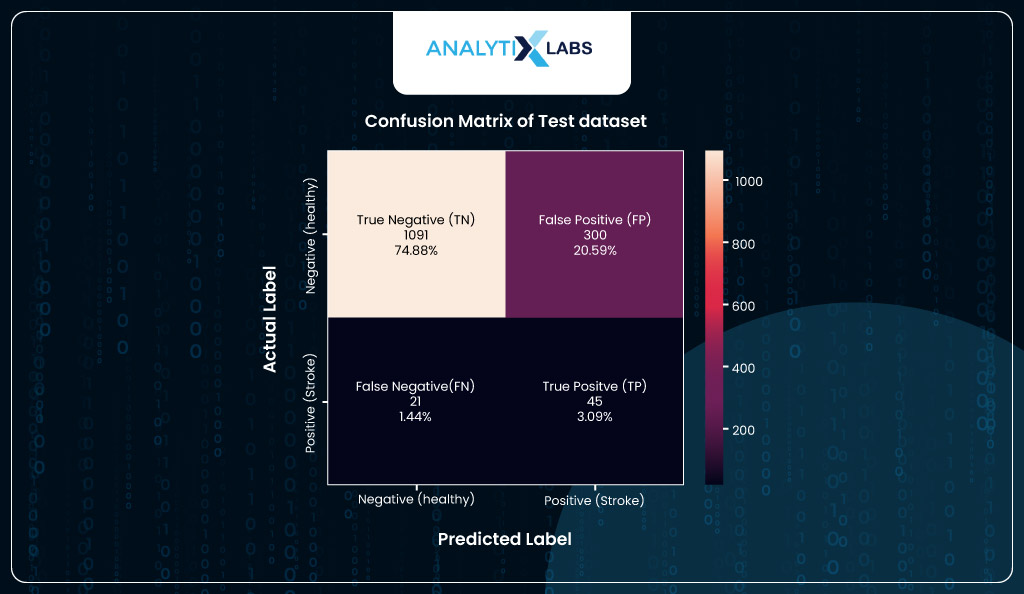
Lastly, to look at the final numbers, you will create a confusion matrix using the new predicted classes of the test dataset. According to the confusion matrix, the model correctly predicts 45 individuals with heart stroke (TP). While the number of FP is high, it’s good that it’s higher than FN, as it’s better to incorrectly call out someone than to predict that they are healthy and will not have a stroke when they actually will have. Ideally, we should minimize FN in such health scenarios, even at the cost of high FP, because precaution is better.
# creating the confusion matrix with the classes created using the optimized threshold

import seaborn as sns

# creating confusion matrix

cm = metrics.confusion_matrix(test_scores.y_true, test_scores.y_pred_new)
# creating label with outcome names and their count in absolutes and percentages

l1 = ['True Negative (TN)','False Positive (FP)','False Negative (FN)','True Positive (TP)']
l2 = ["{0:0.0f}".format(value) for value in cm.flatten()]
l3 = ["{0:.2%}".format(value) for value in cm.flatten()/np.sum(cm)]
label = [f"{x}\n{y}\n{z}" for x, y, z in zip(l1, l2, l3)]
label = np.asarray(label).reshape(2,2)
# creating a heatmap

ax = sns.heatmap(cm, annot=label, fmt='')
# setting title, x and y labels

ax.set_xlabel("Predicted Label", fontsize=14, labelpad=20)

ax.xaxis.set_ticklabels(['Negative (healthy)', 'Positive (stroke)'])

ax.set_ylabel("Actual Label", fontsize=14, labelpad=20)

ax.yaxis.set_ticklabels(['Negative (healthy)', 'Positive (stroke)'])

ax.set_title("Confusion Matrix of Test dataset", fontsize=14, pad=20)

plt.show()
Scoring
Once the model is built, you wait for the new data to arrive. Once available, you use the model to come up with predictions based on which some action is taken.
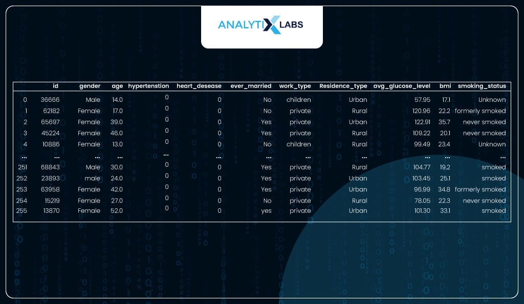
Here, you use the 5% of the data you left out, which doesn’t have a dependent variable.
# importing new data

health_data_new =  pd.read_csv('dataset/stroke/healthcare-dataset-stroke-data_serving.csv')

health_data_new
EDA and Data Preparation
Let’s understand this data and prepare it so it can be used by the logistic regression model created above.
The data has 256 observations for whom prediction needs to be done.
# viewing shape

print('Number of rows are {} | Number of column are {}'.\

format(health_data_new.shape[0], health_data_new.shape[1]))
You extract only those columns on which the model was built, as only these columns will be required for the model to work.
# extracting all the required columns

df_new = health_data_new[['age', 'ever_married', 'heart_disease',

'hypertension','smoking_status']]
Next, you check for missing values. There is no need for missing value imputation as there are no missing values.
# checking for missing values

df_new.isna().sum()
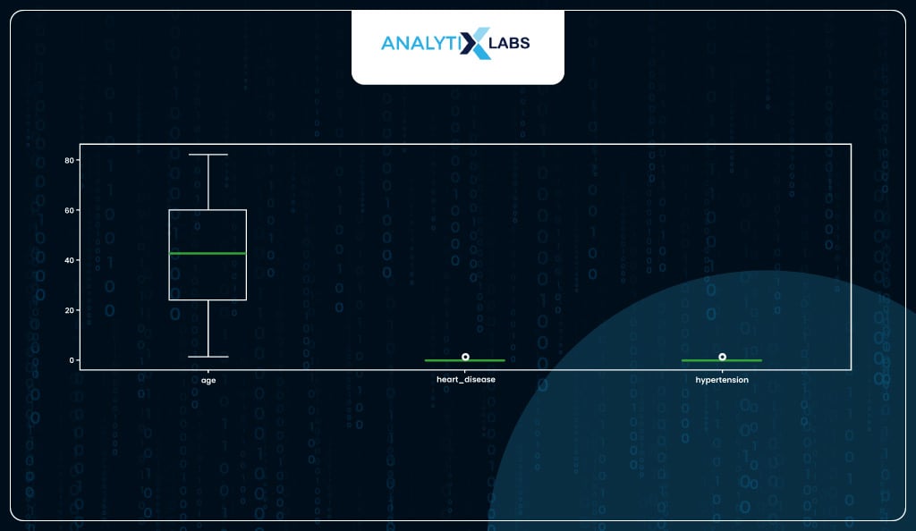
You can also check for outliers; here, no action needs to be taken as there are no outliers.
# checking for outliers

df_new.plot(kind = 'box', figsize=(17, 5))
Now, you will check for any columns that are not numeric.
# checking the column data types

df_new.dtypes
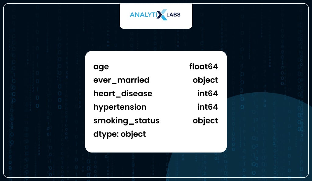
You perform label encoding because a few columns with the object data type exist.
# performing label encoding on the columns with data type object

label_encoder = LabelEncoder()

obj_cols = df_new.dtypes[df_new.dtypes=='object'].index

for column in obj_cols.tolist():

df_new[column] = label_encoder.fit_transform(df_new[column].values)
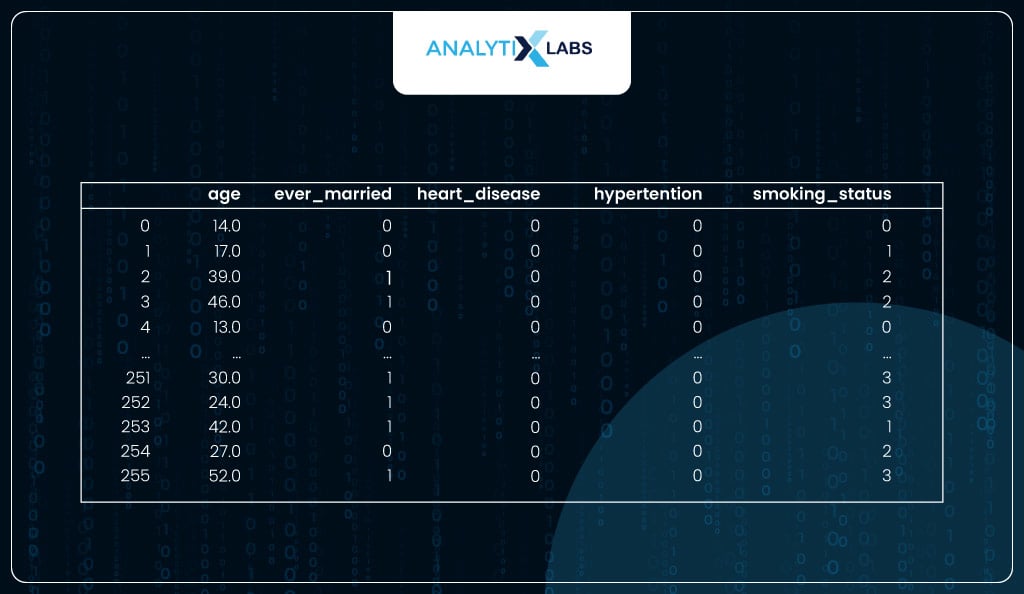
Now, the data seems to be ready for the model.
# viewing the processed data

df_new
Using Model for Predictions
As the data is ready, i.e., it has no missing values, outliers, or object data type columns and has only the required columns, you can finally use the model.
Using the optimized threshold calculated before, you used the model to predict probabilities and convert them into predicted classes.
# using the model and the optimized threshold to predict classes for the new dataset

health_data_new['stroke_prediction'] = pd.Series(

model.predict_proba(df_new)[::,1]
).map(lambda x: 1 if x > optimized_threshold else 0)
The model predicts 64 individuals at risk of having a heart stroke.
# counting the number of different predicted classes

health_data_new.stroke_prediction.value_counts()
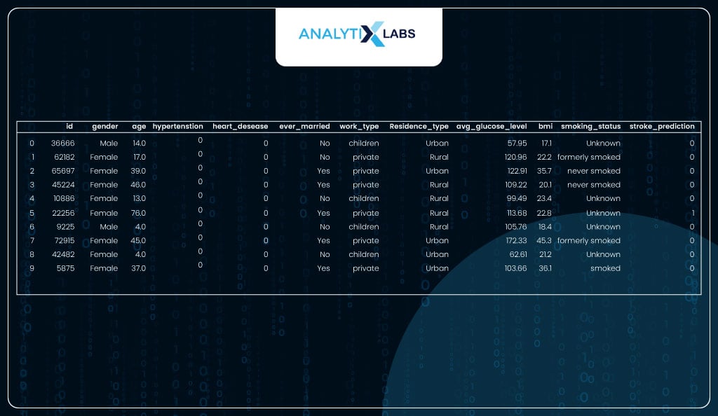
This data with the predictions can now be shared with other departments that will take action based on the predictions. For example, if a health insurance company runs the model, the individuals with the risk of a stroke can be contacted and asked to take preventive measures.
# viewing the data with the predictions

health_data_new.head(10)
Before we conclude, let us discuss a common question that gets raised a lot: the difference between linear and logistic regression and whether there is a difference between the two algorithms in Python.
Linear Regression vs. Logistic Regression in Python
Linear and Logistic Regression are two different algorithms. While linear regression predicts continuous values, logistic regression predicts probabilities. There are several differences between the two algorithms.
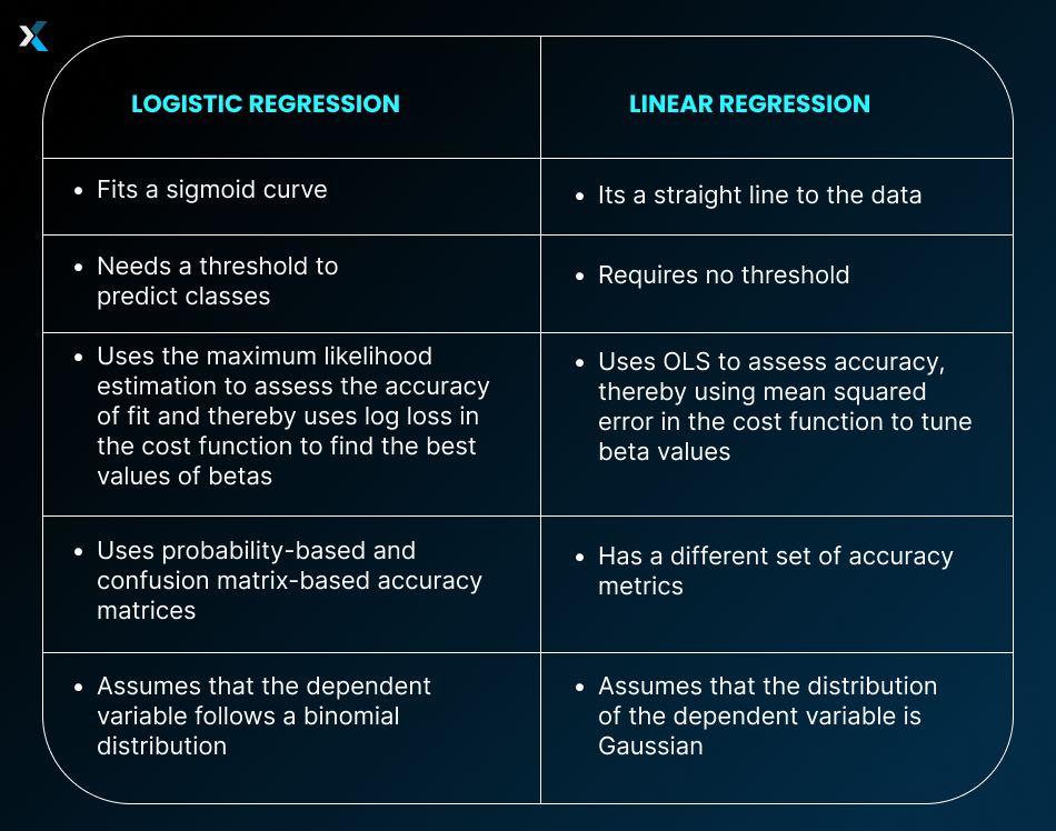
In Python, too, all these differences come up when using these two algorithms. There are separate models in statsmodels and sklearn that allow you to create linear and logistic regression models.
Conclusion
Python has proved itself time and again to be a highly versatile tool capable of implementing all types of algorithms, from statistical to machine learning and deep learning. As you saw, it could easily implement the logistic regression algorithm and had ample functions to aid us in the model-building process.
The fact that Python has great data manipulation and visualization libraries like Pandas and Matplotlib makes it easy for us to clean data and visualize the various aspects of the process. Lastly, the great thing is that if you learn to implement a logistic regression machine-learning model in Python, you can easily use that knowledge and implement other machine-learning algorithms.
FAQs:
- What is logistic regression in Python?
Logistic regression in Python is a class of models that uses the logistic regression algorithm to solve binary classification problems. If you want to perform logistic regression machine learning, then you can use sklearn, while for running a statistical logistic regression, you should go for statsmodels.
- How accurate is logistic regression in Python?
Python’s logistic regression models can achieve high accuracy, provided that your data is preprocessed to meet the necessary assumptions of the logistic regression algorithm. Additionally, sklearn offers various parameters that can assist in mitigating overfitting and enhancing the model’s performance when applied to testing or new datasets.
We hope the logistic regression Python example used in this article helped you understand the various libraries that can be used to build a logistic regression model. If you want to learn more about logistic regression machine learning or want to implement other algorithms, then do get back to us.

![Learning Logistic Regression – Applications using Python [Part 2- Practical]](https://www.analytixlabs.co.in/blog/wp-content/uploads/2023/11/Learning-Logistic-Regression.jpg)


![How to Perform Data Analysis using Python – A Case Study With Sales Data [Codes Included] data analytics using python](https://www.analytixlabs.co.in/blog/wp-content/uploads/2024/09/Cover-Image-1-2-370x245.jpg)


